Saturday, December 19, 2009

Imaging technology oddities

Just some miscellaneous imaging technology oddities lying around my desktop that I thought were interesting and didn't fit anywhere else.

Click on images to enlarge

Eugene Omar Goldbeck was a photographer who specialized in large scale group portrait, events, and scenes.
Shield made up of 30,000 troops. 1918
Portrait of Woodrow Wilson made up of 21,000 troops. 1918
Insignia made up of 5,100 troops. 1918

Christian Faur is an artist based in Granville, Ohio, who creates pictures out of crayons by packing thousands of them together so they become like the colored pixels on a TV screen.
He starts each work by scanning a photo into a computer and breaking the image down into colored blocks He then draws a grid that shows him exactly where to place each crayon The finished artworks are packed tightly into wooden frames. He actually makes the crayons himself, hand-casting each one in a mould.


Daniel Rozin is an artist who uses interactive art that allows the viewer to create the image. The image is made using a variety of moveable elements controlled by software and servo-motors.
This example is "Wooden Mirror" from 1999 and uses 830 square pieces of wood acting like digital pixels to deflect light and create different tones.

Press play arrow to view video.


Shapeways creates customizable 3D mini branding irons that click onto standard disposable lighters. You simply turn the lighter on for 30 seconds until the branding iron is hot and then brand away. They can create text or logo graphic branding irons.


Oleksiy Pikalo's latte printer is quite sweet.


ESCP Europe is a top ranked international business school. It has campuses in five major European cities: Paris, London, Madrid, Berlin, and Turin.
This video was made by the students using bodies and clothing to create images.

Thursday, December 17, 2009

iPhone Prepress - Australia style

Dwane Hollands of Hollands Print Solutions Australia (http://www.hollands.com.au/) has what is likely one of the most unique workflows in the business – he can manage his prepress via iPhone.
At his current imaging speed he can do 12 plates an hour with two plate cassettes dedicated to his four colour Sakurai A2 machine. That equates to about 120 plates (60 plates per cassette) and, all things going well, he could drive a 10 hour, lights-out shift until his CtP ran out of plates and required human intervention.

However, his concern was about what would happen if something goes wrong and plate output stops during the night shift after the last person leaves the building. So he came up with a way to monitor the CtP Controller while he is off site. Since Kodak installs a VNC server on the Controller so they can dial in and operate the machine for remote servicing, Dwane took the same route and downloaded a free VNC client for his iPhone. At first he connected via Hollands' internal WiFi network and was able to log onto the VNC Server for the Magnus CtP controller. He then took it up a notch by implementing a VPN (Virtual Private Network) connection. With that setup he can click on windows and use menus. Zoom in using the pinch out and pan with his finger. He has also connected via the 3G network using his VPN and was again able to view and interact with the Magnus controller. The beauty of the VPN method is that he can connect to any VNC machine on the network - including his Matchprint and Prinergy Servers. On Leopard Macs, such as his iMac, he's able to simply switch on "Screen Sharing" to enable remote control, so it's cross platform as well.

While there are some teething issues (it disconnects after 6 or 7 minutes) he thinks the likely cause is his lack of VPN expertise or the free software he is using. That being said, as it currently operates, it's completely effective for the company's needs as it only takes about 30 seconds to see if the machine is still outputting plates, or if it requires a shop visit to fix the problem. Ironically enough, at the moment the only thing stopping Hollands from running a lights out night shift is the fact that someone lives next to their factory and the compressor for the CtP is quite loud and runs frequently. Even so, now there's nothing stopping Dwane from working 24/7 from anywhere he finds himself.

Tuesday, December 15, 2009

Heidelberg's Color Atlas

Heidelberg has recently published their own color atlas titled: "Process Colour Look Up Guide" - and it fills a much needed void.
Now, color atlases have been around for quite some time (see my post HERE) however their useability has suffered in many ways due to a lack of adherence to any effective print specification. Heidelberg has solved that problem by producing their atlas according to ISO 12647-2 Amd. 1:2007 printed, in the UK, on both coated and uncoated paper. That should mean that the color atlas would be valid to specify screen tint builds at any printshop that prints according to the specification.
I strongly suggest you contact your Heidelberg representative and try to secure a copy for yourself - they will likely go quickly.

Friday, December 11, 2009

Moiré

A moiré pattern is an artifact that occurs in the print reproduction process when any two, or more, repeating patterns overlap each other.
Moiré in the print reproduction process is similar to the distortion effect on television when a presenter's clothing includes a striped or crisscross pattern as in the gentleman's shirt in the short video below from the WhatTheyThink.com website:

Click image to play

It that case, the presenter's stripe patterned shirt is "harmonically beating" i.e. has a similar frequency and angle to the video camera's sensor and/or the pixels on the computer's display. This results in the appearance of a secondary pattern or "moiré."

The most common types of moiré encountered in the print production process.

Scanning/sampling moiré

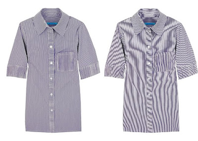
These artifacts are caused by the frequency/angle of the scanner sensor (flat bed and drum scanners, or digital camera sensor) harmonically beating with a pattern in the object being scanned. In this case the artwork ends up having the moiré embedded in it and is part of the image. For example, the original pattern in the pinstriped shirt below (left) acquires a moiré pattern when scanned (right).
If you encounter this type of moiré, there is a Photoshop technique developed by John Wheeler that may help you eliminate it. The tutorial is here: http://tinyurl.com/3mmzv4h

Moiré can also be introduced when a halftone printed image is scanned. In the picture below, the top image is how the photograph in a magazine appears to the eye and below it the result when the image is scanned.

In this case, the moiré is caused by the halftone dots in the magazine reproduction harmonically beating with the scanner's CCD array.

Subject moiré
These artifacts are caused when the halftone screen that is being used to reproduce the image on press harmonically beats with a pattern in the image being reproduced as in the example of the striped shirt below:This artifact is sometimes referred to as "screening moiré" since it is the halftone screen that is causing the problem. However, I use the term "screening moiré" to refer to a different problem - see below.

Screening moiré
Screening moiré, which is a term that is sometimes confused with subject moiré, is actually an artifact caused by either an inappropriate or incorrect halftone screen angle within a CMYK image. With modern screening systems this is rarely a problem. What is most likely to happen is that a screening moiré that is already present is somehow made more visible. For example, the image at left below is a blow-up of a screen tint made of Yellow and Cyan. Because the Y and C screen angles are less than 30° apart they create a moiré. However, because Yellow is so much lighter than Cyan the moiré is not normally visible.However, if the Yellow printer becomes contaminated, as at right above, the existing moiré can become very visible.

Another cause of screening moiré can occur if a prescreened (bitmap) graphic is imaged on a device that has a different resolution than the original art. In the below example a prescreened image that was created at 2400 dpi (standard for North American imagesetters) has been imaged on a 2540 dpi device (standard for the rest of the world):The result is a severe moiré in what should be a flat background screen tone.

Resampling moiré
Moiré artifacts can be introduced when images are resampled (have their resolution changed) somewhere in the production process.
Original resolution car grill at left. Resampled car grill at right.

Moiré, caused by resampling, usually occurs if the image is resized in a page layout program, or when the document is exported as a PDF, or as a result of the RIP settings when the document is processed by prepress.

Obscure moirés
These moirés are fairly rare, but do happen. When other explanations fail, these causes may be worth investigating.

Demosaicing moiré
On rare occasions you may encounter a "demosaicing" moiré. These occur when images with small-scale detail near the resolution limit of the digital sensor in a digital camera sometimes cause the demosaicing algorithm to produce repeating patterns, color artifacts or pixels arranged in an unrealistic maze-like pattern. On the left a properly demosaiced image, and on the right one in which the demosaicing algorithm has caused colored moiré artifacts in the fence and side of the building:
Click image to enlarge

Single channel moiré
The standard photomechanical screen angles do not work best with digital screens. As a result some output device, halftone dot shape, screen angle and frequency combinations can result in moiré within one screen resulting in "single channel moiré."
One solution to avoid this problem was the development of shifted angles. The angular distance between screen angles remains more or less the same however all the angles are shifted by 7.5°. This has the effect of adding "noise" to the halftone screen and hence eliminating the moiré. For that reason, some individual screen sets may vary the requested screen angles slightly in order to overcome the potential for single channel moiré.

Paper related moiré
During the paper manufacturing process the side of a sheet paper that is in contact with the wire or forming fabric of the paper machine is the wire side (also called the reverse or bottom side). The wire side is usually not quite as smooth as the top or felt side and may carry a subtle impression of the wire pattern. If that pattern harmonically beats with the halftone screen pattern a subtle moiré will appear in the presswork. It often appears, and is confused, as a mottle. The difference is that mottling appears as random splotches while wire side paper related moiré appears as splotches that form a periodic pattern.

Avoiding moiré
One of the unfortunate effects of the use of inkjet proofing is that moiré artifacts are no longer detected during proofing cycles where there is an opportunity to deal with them. Instead, they are usually first seen on press at which point the job may need to be stopped resulting in increased costs and schedule disruption.

While the geometries of moiré formation are well understood, I'm not aware of any prepress system that incorporates moiré detection/prediction during document processing. So, the key thing is that print specifiers and prepress technicians have to take responsibility to reduce the likelihood of moirés occurring in the first place as well as being aware of image types that have the potential to form moiré artifacts.

Tips for avoiding scanning/sampling moiré
1- Use descreening software if your scanner application has this option.
2- Try scanning at a resolution equal to the halftone lpi used for the printed image.
Left image scanned at 600 dpi and rescreened. Right image scanned at 150 dpi (same as printed) ready for rescreening.

3- Try scanning the image by placing and scanning the original at different angles.
Left image scanned at 90° shows moiré on face. Right image scanned at 30° - no moiré on face.

Tips for avoiding subject moiré
1- Identify images with the potential for moiré. If the prepress workflow allows it, export the processed halftoned bitmap files of the suspect images. Proof them by viewing at 100% on a monitor or outputting to a laser printer at a magnification equal to the resolution of the printer. (e.g. if the bitmap is 2400 dpi, and the laser printer is 600 dpi, then output the bitmap at 400% (2400/600 = 4)). View the proofs on screen or on paper from a distance to see if a moiré is present.
2- Use FM/stochastic screening. Because this type of screening has no frequency or angle it avoids subject moiré completely.
3- Use FM/stochastic screening for the screen that is causing the subject moiré - typically it's the black printer.
4- Swap screen angles usually the black for magenta.
5- Change separation method to UCR instead of GCR.

Tips for avoiding screening moiré
1- Use FM/stochastic screening for the yellow printer. If you're using a 150-200 lpi AM/XM screen then use a 35 micron FM/stochastic since it will have a similar dot gain curve.
2- Make sure that incoming halftone screened bitmap files have a resolution that is equal to or an even divisor of the resolution of the output device. Make sure that those bitmapped images have not been resized in a page layout application.

Tips for avoiding resampling moiré
1- Import images into page layout applications at 100% - do not resize in the application.
2- Images should have a resolution that is an equal divisor of the output device. E.g. 300/400/600 dpi are even divisors of 2,400 dpi.
3- Make sure that PDF creation applications are set to not resample images.
PDF creation settings

4- Make sure that prepress RIP settings are set to not resample images.

Friday, December 4, 2009

Fluorescent inks

The pigments in fluorescent inks work by absorbing ultraviolet energy (invisible to the human eye), and transmitting it as longer waves in the visible spectrum.

Cyan, Magenta, and Yellow process inks can be replaced with their fluorescent equivalents for a strange, while at the same time, semi-natural look. Novelty effects in four color process printing can also be achieved by mixing 50% Pantone 803 fluorescent Yellow with 50% process Yellow and 50% Pantone 807 fluorescent Magenta with 50% process Magenta. Alternatively, using one fluorescent ink, usually Yellow or Magenta, in combination with process colors can add impact to the result or help compensate for a poor substrate. This is most often seen in newspaper work where fluorescent Yellow is sometimes used in place of process Yellow.

In addition to the process equivalent fluorescent inks there are some 10 base fluorescent ink colors for print application and which can be used in Hi-Fi image reproduction or as spot/line colors.

Although very bright appearing, fluorescent inks tend to be weak on press and hence should be printed at higher solid ink densities. They often require a double hit, especially on offset coated papers, to bring them up to full potential. They are well suited for gravure printing since that process can lay down a thicker ink film than offset. Note that ink drier additives may be required when running fluorescent inks on coated papers.

Fluorescent pigments, especially the red, are fugitive so exposure to sunlight will rapidly cause fading. Fluorescent inks are not formulated to resist high heat, so they are not suited to stationery that will be run through a laser printer or copier.

Note that the amount of optical brightners used in the substrate to be printed on will have an impact on the final result - see the post HERE for more details.

Friday, November 27, 2009

The Wayback View – How color was taught

Organizing colors into some kind of system may have started some 16,000 years ago with the earliest artists, the Cro-Magnons, who lived in the cave that came to be known as Lascaux in France - as this wall painting and close up seems to suggest.
However, the oldest color system known today originates from the Finnish born astronomer, priest and Neoplatonist Aron Sigfrid Forsius, sometimes also known as Siegfried Aronsen. In 1629, a manuscript appeared in which Forsius expounded his thoughts about colors, concluding that they could be organized into a spacial order.

Forsius states: "Amongst the colors there are two primary colors, white and black, in which all others have their origin." Forsius is here in agreement with Leonardo da Vinci who, more than three hundred years earlier, had included black and white amongst the colors, seeing them next to yellow, red, blue and green as primaries. Forsius then continues: "In the middle, between these colors (black and white), red has been placed on the one side since the classical antiquity, and blue on the other; yellow then comes between white and red, pale yellow between white and yellow, orange between yellow and red ..." and so forth, until Forsius has completed the whole circle. Forsius uses four basic colors (red, yellow, green and blue) which he observes, together with grey as a "median color", between the two extremes of black and white. Forsius had the idea of introducing four basic chromatic colors, applying for each color a gray scale which runs from bright to dark along the central axis of a sphere. The colors on the sphere's surface are arranged in such a way that three opposing pairs are created: red and blue, yellow and green, white and black. Forsius had thus paved the way for modern color systems.

Click on images to enlarge.

Phillipp Otto Runge 1810
From "Handbook of Lithography" 1919
From "Show Card Writing" 1922
From "The Art of Colour" 1924
From "Commercial Art" 1930
From "The Age of Color" 1936
From "Color" 1943

From "Practical Printing and Binding"1946

Sunday, November 22, 2009

How CtP plate readers read plates


Dedicated plate readers take a different approach to measuring dot area than densitometers. What they do it use an internal CCD camera to take a continuous tone photograph of the plate area at high resolution and magnification:

Depending on the instrument's software and display technology, this original image may or may not be shown to the user.

In order to calculate the dot area, virtually all plate readers use a thresholding algorithm to determine what is the non-printing plate and what is the printing dot.* Put another way, the software decides that a pixel of X tone level and lighter in the captured image is the plate while levels darker in the captured image than X tone level are identified as ink carrying dots.

However, because the halftone dots in the photo will have a slight softness to them, the result is a slight ambiguity as to where the transition from non-image plate to ink carrying dot occurs. Change the threshold and you change the size of the dot the instrument "sees" and hence the tone the instrument reports.

For example at a threshold value of 139 (from a range of 0-255), the software sees this as the printing dots:
and reports a dot area value of 50%

If the threshold is a tone value of 175 the software sees this as the printing dots:
and now reports a dot area value of 55%

So which is best, or more accurate, for measuring halftone dots on plate? Well, in a GATF study of products for measuring the dot area on CTP printing plates (RTR 27: Plate Reading Technologies and Their Performance on CTP Plates) a spectrodensitometer gave very similar overall results compared to the best CCD-based solution for plates.

In their defense, dedicated plate readers can provide more information, such as halftone frequency and screen angle, than a densitometer when measuring plates.

* The extremely sophisticated and expensive Jandel planimeter requires the user to trace where they believe the dot edges are in order to differentiate between plate and dot areas.

Monday, November 16, 2009

Using a densitometer to measure plates

Despite what you may have heard from vendors - yes, you can use a densitometer to read offset plates. This can be especially helpful for the smaller printshops who may not have the resources to purchase dedicated plate readers.

Densitometer basics

Color reflection densitometers are designed to accurately measure Black, Cyan, Magenta, and Yellow colorants on substrates like paper. However lithographic plates usually don't have C, M, Y, K images on a white substrate, instead the plate material is usually brushed aluminum with a grey color. The color of the image itself will vary according to the plate type and vendor.

You need to be aware of these reflectance and color properties since they effect how you use your densitometer when evaluating your plates.

Contrast

Because of plate color properties, the contrast between image and and non-image areas of the plate is typically less than half that of ink on paper, as a result it may not be possible to calculate dot area for some densitometer/plate combinations.

Aperture size

The densitometer aperture (measuring window) should be the largest possible for your brand of instrument - as long as it's not larger than the image area you are measuring. This helps average out the reading and minimizes the effect of random plate patterns.

Densitometer Status

The instrument should be set to "Status T" unpolarized in part because this setting has a wider response to the various plate coating colors.

Consistency is more important than absolute accuracy

Conventional and digitally imaged plates typically use the same aluminum base material. However the different types of mechanical or chemical graining that prepares them for lithography results in a different surface texture which in turn scatters light differently. In order to achieve consistent dot values. To help achieve consistent dot value measurements, you should try to maintain a consistent alignment of the densitometer to the plate. Perhaps using the base of the densitometer aligned to the edge of the plate. Also, zero the densitometer and read the 100% area on the same spot each time and take readings from the center of each target patch.

If you know that a patch on the plate represents a 50% tone (i.e. it is a checkerboard) but your densitometer reports the patch being, for example, a 54% tone while the plate prints correctly on press then 54% becomes the target for that patch on the plate. The idea is that you are controlling your plate imaging process by monitoring and minimizing variation. Your priority is to maintain consistency in the measured dot areas.

Alternatively you could change the dot gain calculation "N" factor. Densitometers use one of two formulas for measuring dot area; the Murray-Davies or the Yule-Nielson equation. They are the same equation however the Yule-Nielson equation utilizes an "n"-factor to "factor" out the optical dot gain (the Murray-Davies equation is equivalent to the Yule-Nielson with n set to 1.00). The n-factor is experimentally determined by adjusting it until the densitometer reads the ‘desired value’ at a known dot percentage. Typically a 50% tone is used because it is easy to spot. You'd print a number of tone values close to 50% (e.g.45% and 55%) then use a loupe to find the tone patch that ‘looks like' a 50% tone - a checkerboard. Next adjust the n-factor on the densitometer until that patch reads 50%. The n-factor is typically applied when a densitometer is used to measure printing plates since printing plates are assumed not to have any optical dot gain.

Friday, November 6, 2009

Print buyers, dollars, and sense

Print buyers often say their purchase decision is based solely on price – even when they know it’s not true. Unfortunately, print salespeople, brainwashed by hearing this over and over again, tend to believe the buyer. Buyers know the strategy works – so they use it. Counter this argument with a total value approach.

Print consists of product and service. Analyze the customer’s success factors for the project in product and service terms. Look beyond what the customer says is important to include criteria from similar projects as well as the customer’s history. Look beyond the cost of your part of the project and look at what you could do to reduce the buyer’s overall project cost. Your print quote should reflect the customer’s unique needs and objectify the value you bring to the table by putting a dollar value on the benefits the customer will receive by dealing with you.

When you get the job, make sure that the reasons for getting the job are communicated to everyone in the production process so that they can help validate, through their work, the buyer's decision to award their business to your shop.

Wednesday, October 28, 2009

Choosing the right screen angle for over-printing spot colors


To decide which screen angle to use when a screened PMS/spot color overprints a 4/C process image you will need to look carefully at the image that you will be overprinting.

The basic rule is to use the screen angle of the least prominent (or missing) screened process color that will be underneath the screened spot color.

For example, if there's no screened black under the spot color - use the Black angle, if there's no Cyan use the Cyan angle, etc.

Try to avoid using the Yellow screen angle because in standard screen angle sets yellow is only 15 degrees away from C or M. As a result moiré is always there but it is usually not visible because the yellow is so pale. The moiré can become visible however, if the yellow becomes contaminated - or if it is used for a dark spot color.

For example, in the graphic below, the left image is Cyan (at 105°) overprinted with process Yellow at the standard 90°. The moiré is barely visible. However, in the center image overprinting Cyan with PMS 144 – a very dark yellow/orange color – using the same Yellow screen angle results in the existing moiré becoming very visible. On the right, PMS 144 uses the Magenta screen angle (75°) instead which eliminates the halftone moiré seen in the center image.

Alternatively, you could try running the 5th color using a second order FM screen. If you're using a 175 lpi AM/XM screen then the FM should be about 35 micron because if it's any finer you'll need to create dot gain compensation curves for the FM. Because 35 micron is a fairly coarse screen it is best used for fairly light colors otherwise you may find that the screen is too visible.

Because spot/PMS colors are typically formulated to be printed solid and not halftone screened, make sure that your ink vendor knows that you are going to be screening the ink and the dot size range as well (either in microns or lpi) so that they can formulate the inks accordingly.

Friday, October 23, 2009

Know your customers

When a customer places their print order, the company has an opportunity to find out much more about customer preferences than it could ever learn through traditional market research. Even when a project is lost to a competing printer, there is an opportunity to learn a great deal about the competition. Hunches and feelings are no substitute for hard data, so gather in a database as much information about customers as possible. Building relationships is the key to success and those relationships depend on intimate knowledge. You could potentially profile your customers, workflows, and presswork so that in the future you will be better able to tailor production and service for each customer and each project. Referring to this information can also lead to better-tuned estimates, guide new equipment purchases, and suggest new service opportunities.

Thursday, October 22, 2009

Printing prepress - literally

A fascinating insight into how production printing was done before mechanized printing presses that is still being done today.

Founded in 1729, The Derge Parkhang is the last remaining Tibetan printing temple of its kind. The Parkhang stores more than 300,000 woodblocks that are used to publish sutras, commentaries and histories of Tibetan Traditional Buddhism.


Please press the play arrow to view the video. Note that it may stop for a moment while the video buffers in the background.

More information can be found on the Derge Parkhang YouTube channel by clicking HERE.

Saturday, October 17, 2009