Sunday, May 30, 2010

The issue of metamerism in print production

With print, each medium in the production process from original art to image capture, monitor display, proof, and final presswork has its own unique spectral characteristics. The majority of color reproductions utilize cyan, magenta, yellow, and black inks or colorants. But none of those inks are exact spectral matches to the media originally used to produce the original art. As a result, the inks used to create color reproductions are combined to simulate an artwork, but only under one industry standard light source - referred to as "D50" or "D65".

During production the integrity of the reproduction of artwork is monitored by making comparisons, for example, original to its copy or proof to presswork. The two colored objects are referred to as a metameric pair if they match under at least one combination of illuminant and observer and not match under at least one combination of illuminant and observer. They must also have different spectral response curves.

So, the phenomenon of metamerism begins with comparing a pair of colored objects. For example the color of the back door of this truck compared with the color of the rest of the truck.
In the truck example the pigments used in the paint were not the same for the back door compared with the rest of the truck. The two colors would have matched under the artificial lighting that was used when the door was painted. However, under sunlight conditions the door and body no longer match causing "metameric failure."

In this case metameric failure is a benefit to the prospective customer since it warned that the door was painted at a different time from the rest of the truck. Possibly it had been damaged and subsequently repaired. Unfortunately the effect of metameric failure in print production usually causes problems rather than benefits.

How metameric failure impacts print production

There are four types of metameric failure commonly encountered in print production.

Sample metameric failure This is the most common cause of color matching problems. The truck example above is an example of sample metamerism. Because proofs and press sheets form metameric pairs, this problem typically shows up when presswork matches the proof in the light booth at press but no longer match under the lighting conditions where the presswork will normally be used, e.g. a package in a store, or brochure in a home environment. Other examples of sample metameric failure include product samples (e.g. fabric) compared with their reproduction in proofs, presswork, or computer displays. Or process color screen tint builds. They may match under one lighting condition but not another. Sample metameric failure can also happen if two prints using very different technologies - such as offset print vs silkscreen print - are compared under different lighting conditions.

Observer metameric failure This can happen because of differences in color vision between observers. Although the common cause is colorblindness, it is not uncommon among "normal" observers. As a result, two spectrally dissimilar color surfaces may produce a color match for one person but fail to match when viewed by a another person. Observer metameric failure is the reason there were 31 individuals tested to derive the original 1931 "standard observer" values adopted by the ISO and that are still used today as the basis for the majority of color science.

Field-size metameric failure This occurs because the relative proportions of the three light sensitive cone types in the retina of the eye vary from the center of the visual field to the periphery. The result is that colors that match when viewed as very small, centrally fixated areas may appear different when presented as large color areas. This is the reason why color painted on a wall may appear different than the paint chip used to select the color even though they match when the chip is placed on the wall. In print production field-size metameric failure typically occurs when small PMS swatchbook samples are used to specify a PMS color that will cover a large press sheet area.

Geometric metameric failure Normally, material attributes such as translucency, gloss or surface texture are not considered in color matching. However here, identical colors appear different when viewed at different angles, distances, light positions, etc. Geometric metameric failure is most often seen when using metallic inks or paper, and specialty ink coatings or papers.

Tips for dealing with metameric failure

1. Be aware that it exists and may be the "simple" issue causing any color match issues.

2. If color needs to align across different lighting conditions choose pigments carefully or make the ink formulator aware of that requirement.

3. Control your lighting conditions - both for producing prints, final viewing (where possible), and for critical evaluation. The industry standard light source is referred to as "D50" or "D65" (5,000° Kelvin (North America), 6,500° (Europe).

4. Invest in PIA/GATF RHEM light indicators for everyone in the production chain that is involved in evaluating and approving color. RHEM light indicators are small (2" x 3/4") paper stickers with a unique printed design that uses metameric failure to indicate whether or not the viewing conditions are 5,000° K or not.
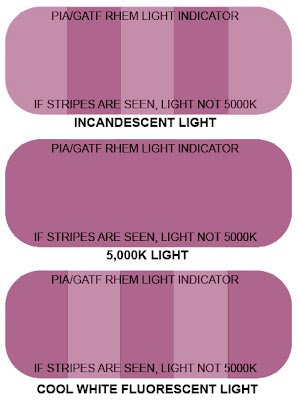
Stripes appearing in the RHEM sticker indicate the lighting conditions and therefore whether a color evaluation can be made.

The stickers can be affixed to proofs or simply carried in a protective wrapper in purse or wallet.

5. Printshops should have viewing areas away from the press that allow print customers to view the presswork under typical lighting conditions (fluorescent and incandescent).

6. Be sure that all instruments (e.g. spectrophotomers) that are used for color evaluation are set to the same standard illuminant, D50 or D65, and same observer angle (typically 2°).
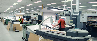
What is wrong with this scene?

Tuesday, May 25, 2010

The Wayback View – Stereotype plate making

A trip to our local charity thrift shop this week turned up a surprising treasure:This is a paper matrix that was used to cast the plate for the September 27, 1971 front page of our local newspaper. This close up shows how deep the original halftone image (on the left) and type (on the right) were pressed into the paper matrix that would later be covered in molten metal to form the actual printing plate:
Here is a short video clip from 1950 that shows the process of making a newspaper stereotype plate from a paper matrix.
Preview images from the video


Please press the play arrow to view the video. Note that it may stop for a moment while the video buffers in the background.

Friday, May 21, 2010

The Pantone Hotel - a bold new color space

Pantone, the international brand best known for its spot color palettes, has opened a hotel located in the heart of Brussels just a 5-minute walk from the fashionable Avenue Louise and Metro Louise.
Designed by Belgian interior designer Michel Penneman and Belgian architect Olivier Hannaert, the Pantone Hotel is a boutique property housing 59 austere guest rooms which are described as "works of art" by Pantone.Each of the hotel’s seven floors are schemed with different color palettes to complement guests’ emotions with distinctive hues – from "earth, rich" to "cheerful, warm," "captivating, esteemed, silky" or "fresh, eager.The cost of a night's stay is about the same as the cost for one of the company's color swatchbook guides.

The hotel also offers the Pantone Lounge, which offers cocktails suited to guests' moods, such as Pink Champagne PANTONE 12-1107, Lemon Drop PANTONE 12-0736 or Daiquiri Green PANTONE 12-0435.
PANTONE Color consultants are also available by appointment for informal color consultations or to present educational seminars on color psychology and trends.

The Pantone hotel follows the company's move into other branded merchandise such as mugs and clothing and includes amenities from the collection and the largest selection of Pantone products worldwide.
More information about the Pantone hotel can be found HERE.

Wednesday, May 19, 2010

For Print Buyers: Get printing for free (well almost)

When costs are estimated to print a job, the shop will try to fill the press sheet in such a way as to minimize wastage to reduce cost.
Typical imposition - the press sheet is filled to capacity.

For a variety of reasons, that's not always possible.

For example, the shape of the document relative to the press sheet may not make full use of the available space as in this poster:
Or the document may include odd-shaped die cut elements as in this carton package example:
Those "off-cut" blank areas needn't just go into the recycling bin. They can be put to good use by adding another document that simply tags along with the proper job. Perhaps a promotional piece:
Or to print test elements to gain knowledge for future projects:
If the print buyer has a good relationship with the printshop then, typically they will be charged very little, if anything, to add these kinds of files to a print job. Here are a few guidelines to keep in mind:
1) Always ask for an imposition layout form when a job is being quoted. That will indicate whether there is any available off-cut space.
2) Get permission from the end print customer to run a tag-along file.
3) Make sure that the press operator understands that the main client job takes priority on press.

Tuesday, May 11, 2010

Fade to black - ink permanence

Unfortunately, ink, like most things in life, is not permanent. The inks used in print production will all fade over time. The main cause is exposure to light (especially UV), which causes the ink/paper system to oxidize. When ink is oxidized it fades. Fading is much more complicated than is usually realized as it depends on environmental factors (light, heat, humidity,), the particular pigments being used, and the substrate the ink was applied to.

Ink manufacturers use fadeometers, along with known ink pigment characteristics, to test fade resistance by exposing the print to light radiation produced from a carbon arc or xenon tube. The arc emits an intense actinic light which in a matter of hours approximates the destructive effect of a much longer period of ordinary daylight. Although it does not exactly duplicate the effect of prolonged exposure to natural light, it is still an effective indicator of the degree of light stability and of the comparative resistance to fading. The results are interpreted with the aid of a chart that correlates the number of hours a printed sample lasts in the fadeometer to the equivalent exposure to direct sunlight taking into account the amount of UV light that different regions receive based on their latitude.

If resistance to fading is an important criteria for a print project, the best source of information is the vendor supplying the inks. They will know the characteristics of the pigments in their ink formulations and can suggest alternatives that may provide better fade resistance - though often at the expense of some other attribute like rub resistance, color vibrancy, or cost.

You can also do a simple test yourself. Simply take a presswork sample and cover half (front and back) with heavy black card. Then attach the sheet to a window.The covered section of the press sheet is the control against which you can compare the fading of the exposed part.
Original image

After 1 month

After 12 months

After 18 months

After 24 months

Some typical fade resistance numbers for sheetfed 4/C process inks based on outdoor exposure near the equator:

• Black (pigment black 7)
- Tint - Max tolerance: greater than 12 months.
- Fadeometer, Max tolerance: greater than 240 hrs.

• Process Cyan (pigment blue 15:3)
- Tint - Max tolerance: 24 months with fading
- Fadeometer, Max tolerance: 120-160 hours shows fading and loss of gloss

• Process Magenta (pigment red 57)
- Tint - Max tolerance: less than 1 month with fading & loss of gloss
- Fadeometer, Max Tolerance: 5-25 hours shows fading and loss of gloss

• Process Yellow (pigment yellow 12)
- Tint - Max Tolerance: less than 1 month with fading
- Fadeometer, Max Tolerance: 2-30 hrs shows fading and loss of gloss

How lightfastness is measured


The "Blue Wool Scale" is the internationally recognized method of quantifying lightfastness, defined under the British Standard BS1006. The scale consists of 8 different strips of wool, each dyed with a blue dye of differing lightfastness. The scale ranges from 8 (excellent – very low rate of fading) to 1 (very poor – extremely fast fading). The blue wool scale is not a linear scale but is rather logarithmic, so that each increase in level is greater than the previous.

When exposed in the same manner as the print for the same length of time, the level of fading of the printed solid is compared to that of the equivalent strip of wool to provide a value indicating the lightfastness of the print.

The "Wool Scale" lightfastness classifications are:
WS 1 - very poor
WS 2 - poor
WS 3 - moderate
WS 4 - fairly good
WS 5 - good
WS 6 - very good
WS 7 - excellent
WS 8 - maximum lightfastness

Tips for the printer:

• When interpreting degrees of lightfastness into production requirements - real-world conditions need to be taken into account. For example a paper that contains a high degree of wood fiber will soon yellow and therefore effect the color of ink that overprints it - even if the ink has a high WS rating.

• A higher ink film thickness than indicated in the standard specifications will result in an increase of the lightfastness of the print because there will be more pigment particles in a given area to withstand the destructive influence of light. The same applies to a higher pigment load ink. On the other hand a thinner ink film thickness will reduce lightfastness. Also, lightfastness in halftone screened areas is generally lower than in the solids.

• Varnishing and lamination of presswork will generally improve its lightfastness. Specific over varnishes exist which contain UV inhibitors and high-grade resins. These can increase the lightfastness of presswork, however, they will not prevent ‘weak’ pigments from fading, merely slightly increase the time they take to fade.

• If two or more printing inks of different lightfastness properties are mixed, the low WS rated one is not improved by the high WS rated one. Instead the low WS rated one lowers lightfastness of the high WS rated ink. Effectively the ink of the lowest lightfastness determines the lightfastness of the mixed Ink.

• Lightening of an ink with transparent white will, in most cases, diminish its lightfastness. Since white pigment does not fade easily, pastel colors with a small concentration of colored pigment and a large concentration of white will fade rapidly to white. For similar reasons, large quantities of varnish should be avoided in colour matches for presswork exposed to sunlight.

As a general guide, lightening with transparent white at a ratio of 1:1 will reduce lightfastness by 1 grade. Lightening with transparent white at a ratio of 1:3 will reduce lightfastness by 2 grades.

• Lightfastness of presswork exposed to sunlight will be lower near the Equator and higher as one move towards the Poles.

• In the northern hemisphere lightfastness of presswork exposed to sunlight will be lower in the summer and higher in the winter.

Saturday, May 8, 2010

The Wayback View – 1924 - The first color photograph transmitted by wire

The first color photograph transmitted by wire was of the famed actor Rudolf Valentino.
Valentino starring in the motion picture of "Monsieur Beaucaire"

The original separations were sent from Chicago to New York in 1924 by Dr. Herbert E. Ives of the Bell Telephone Laboratories. The separations were made by Max Hofsetter of Powers Photo Engraving of New York. Powers made a three color reproduction using the lines created by the transmission process to create the halftone screening.
Close up of eye area showing the halftone screening of the three-color reproduction.

Rotating each of the three separations as it was mounted on the transmitter enabled the colors to be screened by the transmission process at the appropriate angle relative to one another.
Dr. Ives and the transmitter that was used to send the first color picture in 1924.

To watch a video showing how photographs used to be sent by wire, clink on the link HERE

Wednesday, May 5, 2010

JPEG images for print production - the facts

Saving an image file in the JPEG format is a commonly used method of "lossy" compression for digital photographic images. The degree of compression can be adjusted, allowing for a user selectable tradeoff between storage size and image quality. The greater the image compression the smaller the resulting image file and the greater the loss of image quality.

By default, images are JPEG compressed when saved as a PDF file.

How JPEG compression works

JPEG compression works by chunking similar image pixels that have slightly different color values into groups of pixels with the same color value.
The above original image file size is 1.5 MB.

The same image file saved at highest compression/lowest quality is only 92 KB. (Note: this level of extreme image compression would never be used in production work.)

Subtracting the pixels of the original image from the JPEG image reveals where pixels are different. Note that large areas of no detail like the sky have been chunked into large pixel groupings while areas of fine detail have been chunked into smaller pixel groupings.

The resolution of the original image impacts the effect of JPEG image compression

On the left is the original high resolution image. On the right is the JPEG version. Note that the JPEG artifacts are barely visible.

On the left is an original medium resolution image. On the right is the JPEG version. Note that the JPEG artifacts have become visible.

On the left is an original low resolution image. On the right is the JPEG version. Note that the JPEG artifacts are now very visible.


Bottom line - high resolution images can tolerate a greater degree of compression than low resolution images.

Resaving images, even edited images, in JPEG format does NOT reduce quality further

The original image saved at highest compression/least quality to exaggerate the effects of JPEG compression.

The same image resaved 15 times at the highest compression/least quality. The image was altered before each save to force recompression.

Subtracting the pixels of the original image from the 15th version of the resaved JPEG image reveals where pixels are different. Note that only the areas where the image was altered are different despite being resaved 15 times with high compression/low quality. All other pixels are the same.


Resaving images that have been cropped DOES reduce quality further

On the left is the original image saved with high compression/low quality. On the right is the same image that has been cropped and resaved with the same high compression/low quality setting. Cropping the image causes the chunking of pixels during compression to be redone and introduces artifacts.

Subtracting the pixels of the original image from the cropped version of the resaved JPEG image reveals where pixels are different.


Bottom line - multiple resaves of images with JPEG compression has no effect on pixels (image detail) that have not been edited. Pixels that have been edited will be "chunked" to the same degree as the pixels in the original image. In other words, images do not degrade after multiple resaves using JPEG compression.

The most common level of compression used does NOT result in any visible image degradation.

Click images to enlarge

Original image at left - high quality/low compression on right (Photoshop level 12)

Original image at left - high quality/low compression on right (Photoshop level 10 - the most common level of JPEG compression)

Original image at left - medium quality/medium compression on right (Photoshop level 8)

Original image at left - medium quality/high compression on right. (Photoshop level 6)
Subtle image degradation is becoming visible.

Original image at left - low quality/high compression on right. (Photoshop level 4)
Image degradation is becoming visible.

Original image at left - very low quality/very high compression on right. (Photoshop level 2)
Image degradation is clearly visible.

Original image at left - extremely low quality/extremely high compression on right. (Photoshop level 0)
Image degradation is obvious

Bottom line - at typical JPEG compression levels there is no visible degradation of the original image. In fact, one has to go to unusual levels of compression before artifacts are seen (at least level 8 in Adobe Photoshop).
Images with lots of small detail compress less and mask JPEG artifacts better than images with large smooth tone areas.

Double bottom line - there is no reason to be concerned about saving images in JPEG format so long as the highest quality/least amount of compression option is selected.

Special blog production note.

Unless otherwise stated, all "Original" images were low resolution images. JPEG compression was "0" (lowest quality/highest compression). It was the only way to exaggerate the difference enough to demonstrate the issues. If I had used the actual original images - 14 megapixels in this case - the differences would mostly have been invisible. Note that the Blogger website compresses the images that I upload so there will be compression artifacts in the posted "Original" images that were not in the images that I uploaded.

I strongly encourage you to repeat any of these tests yourself with your own images to confirm, or contradict, my findings.

I'm not suggesting that you use JPEG as your preferred image file type. My intent is only to show how saving an image in the JPEG file format introduces, or does not introduce, artifacts and hopefully shed a light on some commonly held beliefs about this image file format.

Sunday, May 2, 2010

Top reasons why color instruments don't agree

The increased use of instruments like spectrophotometers in the print industry has created an apparent increase in the level of precision in the measurement and description of color. However, the objective accuracy may not be as it seems - when comparing the measurement results from different instruments - even when coming from the same vendor.

Even when properly calibrated instruments can deliver different measurement values (>DeltaE 7 according to a PIA/GATF study) simply because of how the various instruments respond to the gloss on coated paper, aqueous coatings, UV coatings, and lamination. The use of UV cut filters (as is popular in Europe) can also increase the disagreement between instruments.

The top reasons why color instruments don't agree

• Variations in ambient conditions including instrument Induced sample heating resulting in "thermochromism" where Ink changes color due to a change in temperature and "hygrochromism" because humidity changes the way ink interacts with paper and hence its color.It's a good idea to record temperature and humidity levels whenever measurements are taken.

• Noise introduced by reflectometer instability, instrument and environment induced noise and dark current drift.

• Fluorescence in the substrate coupled with variation in the spectral power distribution of the instrument's illumination - too little or too much UV light.

• Instrument Geometry. There are typically no geometric tolerances on low end instruments. Fiber optic instruments tend to have wide geometric tolerances.

• Spectral bandwidth function may be too narrow or too broad and be too variable from wavelength to wavelength.
• No, or inadequate, black level adjustment. Non-black light trap or directionally sensitive light trap.

• Poor instrument maintenance.

• Infrequent or lack of recertification by factory. Lack of periodic verification