Thursday, November 18, 2010

If car manufacturing was toleranced the same way as printing color.

No manufacturing process can be absolutely 100% perfect - so every manufacturing process allows for some degree of variation from specifications. For practical and economic reasons, they all have a certain "tolerance for variation."

So, what if car manufacturing was toleranced the same way as printing color?

Car salesman to purchaser: "You've made a great choice of car model!

Now, this model does come in a choice of parts manufacturing tolerance. First off we offer "pleasing parts fit." It's our best price/value option - after all who cares about real precision except those calculator obsessed engineers anyway? Forget Delta E - we're talking Delta Wheee! with this baby.

The next level up in fit quality is our popular "memory parts fit" model. This puppy is based on our assembler's memory of how the parts should fit. You can be confident about our memory parts fit option because all of our parts assemblers are memory-tested by the factory certified psychiatrist and must have memorized their multiplication tables up to at least 5 times 5. They also need to repeat from memory, with no outside help or notes, at least one of two telephone numbers.

And finally, we offer our very best parts fit option, the "critical fit." This is for the truly discerning buyer. Perhaps someone like you? For critical fit we use the best instruments available to assure a parts fit that meets, and even exceeds industry standards and specifications. Of course, purchasing this option is a bit more complex than our other parts fit, because we will need to work together to determine whether you would like the instruments to use the 1975, 1998, 2001, Six Degrees of Observer, perceptually measured or absolutely measured parts fit method. But, just between you and me, I have to disclose that our parts assemblers do sometimes ignore any standard reference you might embed in the purchase order. However, I'm sure that, in the unlikely case that you are not satisfied with the fit of all the parts in your car, a small discount in price will be sure to remedy your concerns and gain acceptance of final delivery!

We can assure you that with any option you choose we offer a World Class product that has been extensively tested, accredited and delivered around the globe. If the label on the box has our name, you are guaranteed the same high performance every time. Our competition cannot match us! They have no idea how we do it. And because you are such a nice person, we're going to throw in, absolutely free* an over all gloss finish** that'll really make it shine!***. So let's sit down and figure out just what it's going to take to put you in the presswork driver's seat."

Sunday, November 14, 2010

E Ink Color Display - handicapped because of a fundamental color mistake?

E Ink Inc. whose Pearl greyscale displays are used in all the major e-reader devices have introduced a color e-paper display. If successful it may also compete against the new class of tablet computers such as Apple's iPad.

But is the color display handicapped because its engineers made a fundamental mistake in color technology?

E Ink's new Triton display will come in 5-, 7-, and 10-inch varieties, and E Ink seems to think that it will be instrumental in establishing digital newspapers and periodicals.It is claimed to be able to display “thousands of colors,” specifically 4096. However the color is extremely desaturated even in their carefully presented marketing materials. The display's lack of color saturation may actually reveal the cause of the problem.

How the display works

E Ink is short for “electrophoretic ink”. Technically speaking, charged pigments suspended in a clear liquid micro-capsule respond to a voltage that moves black or white pigments to the screen’s foreground.The technology differs from traditional displays because electrophoretic displays reflect light, rather than emitting it. Whereas computer displays and mobile phone screens rely on a backlight to illuminate pixels of different colors, E Ink technology leverages ambient light just like ink on paper.

With the E Ink Triton color configuration, a thin transparent colored filter array (CFA) is added in front of the black and white display. Now the display can also reflect color.The CFA consists four sub-pixels – red, green, blue, and
white – that are combined to create a full-color pixel. The result? A low-power, direct-sunlight, readable color ePaper display.

So what's the problem?

Emissive color displays like those used in LCD computer displays and televisions are based on the additive color model and use red, green, and blue light to produce the other colors. Combining one of these additive primary colors with another in equal amounts produces the additive secondary colors cyan, magenta, and yellow. Combining all three primary lights (colors) in equal intensities produces white. Varying the luminosity of each light (color) eventually reveals the full gamut of those three lights (colors).
The additive color model used by emissive color displays uses combinations of red, green, and blue primaries.

On the other hand, reflective color displays like newspapers and magazines use the subtractive color model which starts with light, presumably white light. Colored inks, or filters, between the viewer and the reflective surface subtract wavelengths from the light, giving it color. In most color printing, the primary ink colors used are cyan, magenta, and yellow.
The subtractive color model used by reflective color displays uses combinations of cyan, magenta, and yellow primaries.

E Ink's Triton color display, although a reflective device, uses the primary colors of emissive devices - red, green, and blue rather than cyan, magenta, and yellow. The result is very poor color saturation and very much reduced color gamut.
Triton color display screen captures - note the absence of Yellow - a color that cannot be achieved with combinations of red, green, and blue filters in a reflective, subtractive color-based display system.


An E Ink video explaining the RGB(!) display technology.

Did the engineers made a fundamental mistake in their choice of color technology?

Wednesday, November 10, 2010

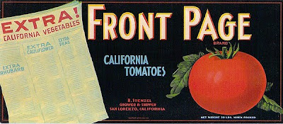
Odd spot - The graphic arts reflected in crate labels

I was rummaging through images of vintage vegetable and fruit crate labels when I suddenly realized that a number of them reflected topics related to the graphic arts topics. Weird or what?

Sunday, November 7, 2010

Thursday, November 4, 2010

The Wayback View - Continuous tone lithography - the Collotype process

Look at any modern presswork under a loupe and you'll see those ubiquitous halftone dots. Even inkjet presses use dots to create the final image.

However, there is a printing process that eliminates halftone screening completely and renders true continuous tone lithography.
On the left is a full image of a 12" x 18" reproduction of a Mondrian painting. On the right is a close-up of just the center of the image. No halftone dots!

Collotype (a.k.a. photo-gelatin, heliotype, albertype, litchdruck, phototypie process)

Collotype is a photographic method of producing a lithographic printing surface in gelatin in which tones can be reproduced without the use of any halftone screen. This reproduction method was devised about 1860 by a Mr. Poitevin and introduced commercially in 1867 under the name "phototypie" by du Motay and Maréchal.

Although it initially became a widely used process, it was very difficult to control and not suited for long press runs. As a result, it was replaced by conventional offset lithography (with its halftone screening) and became a specialized process that was mostly used for fine art reproductions. Today, there are only a very few printers using this process (e.g. Black Box Collotype Ltd in the U.S. and Benrido in Japan).

Collotype printing

The collotype plate is made by coating a plate of glass, or sometimes metal, with a substrate composed of gelatin or other colloid and hardening it. Then it is coated with a thick coat of bichromated gelatin and dried carefully at a controlled temperature (a little over 50° C waters) so it 'reticulates' or breaks up into a finely grained pattern when washed later in approximately 16° C water. The plate is then exposed in contact with the negative using an ultraviolet (UV) light source which changes the ability of the exposed gelatine to later absorb water. The plate is developed by carefully washing out the bichromate salt and dried without heat. The plate is left in a cool dry place to cure for 24 hours before using it to print.
Exposing the film negative This view is of the back of the camera which is set at a right angle to the original art.

An artist/retoucher works on the film negative to make adjustments to the tones of the negative so that they will create a plate that accurately reproduces the original art. With a full color reproduction, all four, or more, negatives will have to be corrected.

The glass plate being exposed.

A photo-electric cell is used to test the tone and color density.

To produce prints, the plate is dampened with a glycerine/water mixture which is slightly acidic , then blotted before inking with Collotype ink using a leather or velvet roller. A hard finished paper such as Bristol, is then put on top of the plate and covered with a tympan before being printed typically using a manual proof press.
Two views of a Collotype press.

The result is a reproduction that is indistinguishable from a photographic print.
Full image and magnified to show the detail.

Collotype printing at Benrido, Japan:

Steps demonstrated include; exposing the art to film, processing and inspecting the film negative, retouching the negative, coating, drying and then exposing the plate to the negative, washing the plate to remove excess bichromate, wetting the plate and making the image level prior to inking, and finally printing the job.

The closest modern equivalent to producing continuous tone lithographic printing is 10 micron FM screening which, even under 10x magnification, appears to not have been halftone screened as in the example below:
Canadian postage stamps are an excellent example of 10 micron FM screening that results in presswork with a similar image fidelity to Collotype printing.