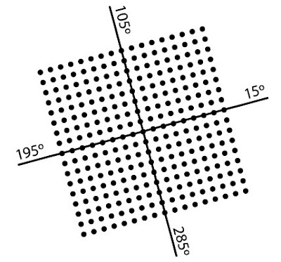
With the exception of FM (stochastic screening), all screens consist of dots arranged in a regular pattern or matrix. The vertical and horizontal distance between successive dot centers is constant and is a function of the screen frequency. When the screen is aligned parallel to the paper edges, the screen angle is said to be 0° or 90°. The rotation angle away from the vertical axis is known as the screen angle. The screen can only be rotated up to 90° before it repeats itself. For example, a screen rotated 15° is at the same angle as 105°, 195°, and 285°.
A black and white halftone image consists of a single screen. The screen pattern is very noticeable when positioned at 0° and is least visible when rotated 45° as illustrated below.
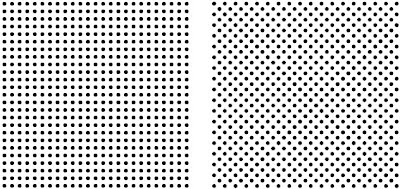
For that reason, black and white halftones are usually printed with 45° angled screens – particularly with coarser screens.
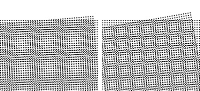
When two (or more) screens are printed on top of each another, a visually objectionable pattern known as moiré may occur. The most serious moiré patterns occur at very small angles between screens. Below are two overlaid halftone grids angled at 5 degrees and 10 degrees apart with the resulting moiré pattern:
The best angle between two screens that is least likely to cause moiré, and is most forgiving to small degrees of error, is 45°. However, in four color process printing, four different screens must be superimposed and all four screens must be angled within the 90° limitation.
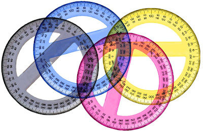
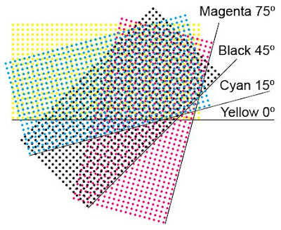
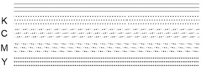
A set of standard screen angles has been established that is based on a combination of theory and experience. First the least visible color, yellow, is placed at the most visible angle 0° (90°). Then the most visible color, black, is placed at 45°. The cyan and magenta are then placed between these two. Cyan at 15° (105°) and magenta at 75°. These angles represent a best all around compromise for most pictures and represent the standard, most commonly used screen angles. They also form the least objectionable moiré – the rosette pattern (
more on rosettes here).
Because the Yellow printer is only 15° from the Cyan printer it produces moiré. The visibility of the moiré can be exacerbated if the Yellow becomes contaminated by ink traveling into it from previous press units. To help reduce the visibility of the Y/C moiré, most screening systems run the Yellow at a slightly higher frequency (lpi) – typically 108% of the frequency of the C, M, and K printers.
 Left: Yellow at the same frequency as Cyan. Right: Yellow at a higher frequency to help reduce visible moiré.
These standard screen angles are based on analog photomechanical screens and do not work best with electronic screens. At angles other than 0° and 45° a type of moiré patterning within one screen "single channel moiré" may occur. To avoid this problem, some vendors utilize shifted angles of 7.5° to introduce "noise" around the edges of the dots in order to break up and eliminate the visibility of single channel moiré.
Most printers will have a standard screen angle set that is used for all their jobs. However, if certain jobs have images where two of the process colors predominate and where those two colors are less than 30 degrees apart, then that screen set should be avoided and a different one used instead.
The following screen angle sets are all valid and are in common use. The sequence for the screen sets listed below is C, M, Y, K (i.e. the first screen set on the list is: 15C, 45M, 0Y, 75K). Remember that screen angles have quadratic symmetry so 0 degrees is the same as 90, 180, and 270 degrees.
Standard 4/C U.S. screen angle set:
15, 75, 0, 45 (possible moiré in greens since C and Y are only 15º apart)
Standard 4/C European screen angle set:
15, 45, 0, 75 (possible moiré in greens since C and Y are only 15º apart)
Other usable screen angle sets: Keep in mind that when two colors are less than 30º apart there is a risk of moiré
15, 45, 0, 75
15, 75, 0, 45
15, 45, 30, 45
45, 15, 0, 75
45, 75, 0, 15
75, 15, 0, 45
75, 45, 0, 15
75, 15, 60, 45
For 2/C jobs (e.g. duotones): Other angles can be used, however, the guiding principle is that the angles should be 30º or 45º apart and that the darkest color should be at 45º to reduce its visibility and lessen "sawtoothing" (see below)
Dark color at 45
Light color at 75
For 3/C jobs (e.g. tritones):
Darkest color at 45
Medium color at 75
Lightest color at 15
For 5, 6, or 7/C jobs (e.g. Hi-Fi color):
Use the angle of the unused color
Violet/Blue uses Yellow or Black angle
Green uses Magenta angle
Red/Orange uses the Cyan angle
Note that, depending on the original CMYK separation, the Black screen angle may be available to be used for one of the extra colors - V/B, G, or R/O.
Dealing with the Yellow printer moiré issue
Interscreen moiré becomes more visible when the angles of any two screens are less than 30 degrees apart. Yellow is usually allowed to be less than 30 degrees because it is such a light color that the moiré is usually not visible. Also, the frequency of the yellow printer is usually made higher than the other three colors (typically around 108% higher) to further minimize the visibility of the moiré. However, the moiré can become more visible if the yellow printer becomes contaminated/dirtied by the preceding process colors, or if its density is too high.
So, when skin color predominates:
15, 45, 0, 75 (avoids M/Y conflict/moiré but introduces C/Y conflict)
Or when light greens predominate:
45, 75, 0, 15 (avoids C/Y conflict/moiré but introduces M/K conflict)
Some printers use a coarse FM screen instead of a conventional AM screen for the yellow printer.
This eliminates the moiré issue completely since FM screens do not have a fixed frequency or angle. For a 175-200 lpi AM screen an FM screen of about 35 microns would be used since that dot size will have a dot gain similar to the AM screened colors.
Other screen angle considerations
In certain circumstances, depending on the size of the graphic and the frequency of the halftone, the selected screen angle can distort the accurate rendering of images.
In the below graphic, the halftone screen angle is the same (45º) but the angle of the gray lines have been changed.
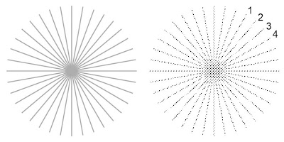
Note how the screen has affected the rendering of the gray lines at different angles. The artifact at 1, 2, 3, and 4 is referred to as "ribboning" and is fairly common in automobile images.
In the below graphic, the halftone screen angles have been changed to the standard 4/C process angles (K 45º, C 15º, M 75º, Y 0º) but the angle of the three gray lines have been kept the same (0º).
Ribboning has appeared in the Cyan and Magenta angles while the Black and Yellow angles have caused the appearance of different dotted line effects.
In the below graphic, the halftone screen angle is the same (45º) but the angle of the gray box has been changed in 10º increments.
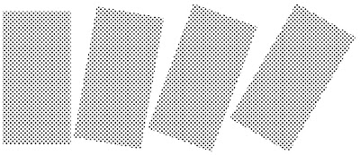
Note how the smoothness of the edges of the box changes as its angle relative to the halftone screen angle changes. The ragged appearance of edge of the last box is referred to as "sawtoothing."
Screen angles for more than four color - i.e. "Hi-Fi" printing (5, 6, or 7 colors)
Four color CMYK process printing is a good compromise that achieves a wide enough color gamut for most applications while using the minimum number of inks to achieve it. However, sometimes the printer needs to go beyond 4/C in order to achieve a satisfactory rendition of the image. Typically the gamut deficiency will be in the overprint colors - Red/Orange, Blue/Violet, Green.
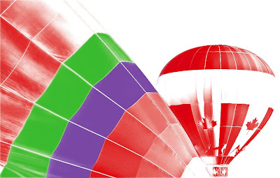
Here is an original RGB image:
And here is the CMYK version of it:
To restore some of the original color impact, the printer may choose to use "bump" or "touch" plates to boost color back into areas where it was lost. However, adding extra colors causes problems since all possible screen angles have already been used by the C, M, Y, and K printers.
In this example, these are the four channels that make up the image:
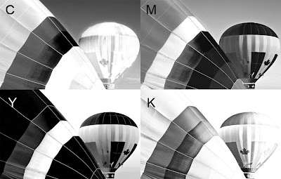
Note that there is virtually no Cyan in the Red/Orange areas, or Yellow in the Blue/Violet areas, or Magenta in the Green areas. Therefore, those screen angles become available for the extra bump inks. So the trick is to use the screen angles of these unused colors.
In this example Violet, Green, and Red:
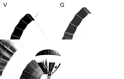
In short, the Violet ink would take the unused Yellow angle, the Green ink would take the unused Magenta angle, and the Red ink would take the unused Cyan angle. Note also that, depending on the original CMYK separation, the Black screen angle may be available to be used for one of the extra colors - V, G, or R.

 This exaggerates the visibility of the dust bunnies. Making them more visible makes it easier to clone 'em out of the original image. Click on the image below to see the dust bunnies (where the arrows are pointing) more clearly.
 The original image was downloaded from HERE


