Monday, September 27, 2010

The Wayback View – The "chromocritic"

Although color films are manufactured for standard conditions of exposure, all the careful work of the photographer and manufacturer may be negated if a transparency, or any color picture for that matter, is viewed under improper lighting conditions.

Today, most people in the graphic arts are aware that the light under which color originals is viewed has been standardized and specified (5000˚K (a.k.a D50) lighting - ISO 3664 - "Viewing and lighting standards"). However, this was not always so.

The "chromocritic" was developed by the Macbeth company of Philadelphia to solve this problem in an ingeniously practical way by assuring accurate interpretation of transparency colors.It contained two manually controlled light sources by which the client could select a certain temperature light at which the transparency pleased him.
Ad men, circa 1959, inspecting a color transparency using the Macbeth chromocritic. The switch on the lower right corner of the device toggles between "Daylight" and "Artificial" light.

Once "pleasing color" had been achieved, an indicating meter would identify the light settings that the chromocritic had been set to. The meter readings, along with the transparency, could then be sent to another ad agency or to the color etcher or lithographer. By setting up their chromocritic to the same readings they could be assured they were seeing the transparency the same way that the client had seen and approved it.
Arrows point to the two chromocritics in a lithographer's color etching department.

The etchers would then use their skills at modifying halftone dots through exposure and etching, combined with their knowledge of the color capability of the final print process to recreate on press, as closely as possible, the approved color that the client had seen on their chromocritic.
The final magazine ad.

Ad for the chromocritic - 1948.

Thursday, September 23, 2010

Eliminating show-through in scans and/or photocopies

Paper is a fairly translucent substrate. The thinner/lighter weight or higher quality the paper the more translucent it is. The result is "show-through" - seeing a ghost image of what was printed on the reverse side - whether reading the page itself or scanning/photocopying it.
Scan with color bar and text on the next page showing-through.
Close up view of show-through.

To eliminate show-through in scans and/or photocopies, simply place a piece of black paper behind the sheet that you are scanning. This evens out the tonality of the page and effectively eliminates show-through.

Monday, September 20, 2010

Mystery of the Lagorio Chart - Mapping the human tone response

Below is a "Lagorio Chart." The black line represents where the grey tone appears visually equal in luminosity to the color. It is the map of the tone to color response of the human eye.It was published in "The Complete Amateur Photographer" by Dick Boer, 1948. The idea behind its use was to determine how well the panchromatic film that the photographer was using translated color according to how the human eye sees that relationship.

The test method was quite straight forward. The photographer would take a black and white photograph of the Lagorio Chart using panchromatic film and then make a print of that image. The photographer would then plot a curve on the photographic print where the grey patches matched the color bars (now rendered in grey) - plotted using a dotted line in the image below:This chart was also recommended by prepress personnel to help them translate color images into black and white halftones while maintaining the appropriate tonal relationships. Indeed this principle could still be used today to make conversions from color images to black and white in applications like PhotoShop.

So what's the mystery? Well, this is the only chart I've ever seen that plots the grey scale response of human vision. None of my other graphic arts books (and I have quite a library) contains a chart like this. Nor does there seem to be any information on the internet about Lagorio and/or this chart. Who was Lagorio and how did he/she determine the human eye's tone response? Was it just what he saw, or were committees of experts involved? The mystery remains.

If you can shed any light on the Lagorio Chart - please contact me via email (pritchard gordon @ gmail (dot) com) and I'll add an addendum to this post.

Thursday, September 16, 2010

The right loupe for the job

Spend any time in a printshop and you'll quickly discover that press operators, and even print buyers, depend on their loupes to help inform them about the quality of plates, proofs, and presswork.This is a quick guide to help you choose the correct instrument for your needs. Beside each type of loupe/microscope is an image to approximate the view through that instrument. Keep in mind that all loupes and microscopes have limitations based on the laws of optics and that prices can vary widely. That is why having more than one instrument is usually best. In general the higher the magnification the smaller the field of view, the shallower the depth of view, and the closer the instrument must be to the subject. A single lens is satisfactory for low power loupes but higher power ones require two or more lens elements for improved resolution and correction of chromatic aberrations, distortion, and improved flatness of field (i.e. the entire viewed area appears in focus rather than just a small area in the center of the view).

Wide field comparator - 2x-6x ~ $50-$100
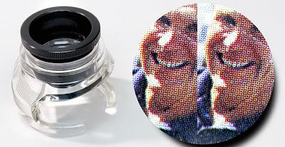
As its name implies, comparator loupes are typically used to compare two items, e.g. proof to press sheet, different paper surfaces, halftone screening methods, proof reading, etc.
Pros: Long eye relief coupled with a wide, flat field of view allows it to be shared by more than one viewer at a time without moving the loupe. Cut-away base allows room for touch-ups or mechanical changes to the item under inspection. Can be used to evaluate large scale issues such as halftone rosette structures and paper/ink mottle.
Cons: Rather limited applications in prepress/press relative to the cost. Low magnification does not reveal halftone quality issues.

Linen tester/folding loupe - 2x-10x ~ $25
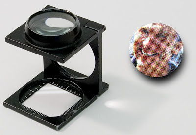
This is the iconic press operator's loupe.
Use: Good for checking registration and macro imaging problems like rosette structure integrity and mottle.
Pros: Inexpensive, portable, easily available.
Cons: Low magnification does not reveal halftone quality issues. No focus adjustment.

Folding loupe (a.k.a. Hastings loupe, Hastings Triplet, Swing Loupe) - 10x-25x ~ $70
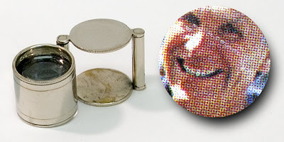
This is arguably the type of loupe actually most used by press operators. Highly recommended as a good all 'round basic loupe.
Use: Good for checking registration and macro imaging problems like rosette structure integrity and mottle. Higher magnification begins to identify issues such as slur and doubling.
Pros: Relatively inexpensive, portable.
Cons: None.

Rigid loupe - 10x-75x ~ $650This magnifier is sometimes used in the press room but is more often used by a Quality Assurance Manager. Very flexible in that it can be customized with different lens options.
Use: Good for checking registration and with higher magnification, to identify issues such as slur and doubling.
Pros: Optional lenses can customize unit for specific shop needs. May come with color filters to enhance the visibility of dot structures. Built-in light.
Cons: Very expensive.

Pen microscope - 25x-100x ~ $100
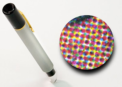
This magnifier can be used in the press room and prepress. 50X is most popular - 75-100x is very good for checking FM screening. An excellent all 'round high magnification tool.
Use: Very good for identifying imaging issues such as slur and doubling.
Pros: Convenient pocket size. Can be focused by manually tilting it but can be difficult to hold steady.
Cons: Expensive.

Lab-type microscope - 25x-100x ~ $250
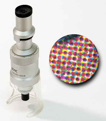
This magnifier tends to be more often used by a Quality Assurance Manager in a lab setting. 75-100x is most popular and very good for checking FM screening.
Use: Very good for identifying imaging issues such as slur and doubling.
Pros: Built-in measuring reticle scale is helpful in analyzing halftone structures.
Cons: Expensive. Typically produces an inverted view.

Digital video microscope - 20x-200x ~ $125
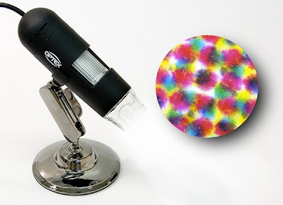
This magnifier tends to be more often used by a Quality Assurance Manager in a lab setting. 200x is most popular and is ideal for checking FM screening as well as detailed analysis of halftone issues. A must-have for any print/prepress shop.
Use: Excellent for identifying imaging issues such as slur and doubling and analyzing halftone reproduction issues. Ability to take photos and videos of halftones and other micro-features enables better record keeping as well as remote diagnostics. Build-in light helps with image quality. Software may be included for more detailed image analysis.
Pros: Still and video image capture. High magnification. Ability to process images with image analysis software. Ability to document and share image capture. Relatively inexpensive.
Cons: Must be tethered to a computer.

Where to buy
Shops that sell binoculars/telescopes, collectibles/stamps, and hobbyist supplies will also carry a selection of loupes and microscopes.
If your local shops can not source what you need - online sources include: http://www.edmundoptics.com, http://www.betascreen.com, http://www.amazon.com, http://www.ebay.com/


Addendum
A reader, "Otherthoughts" described some of his experiences with the lab-type and pen microscopes.

"Regarding inversion and some background about why this was/is important to me.

I used a 25x scope like this for inspecting things a little closer during my press-man/press-room days.
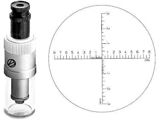
Mine had a metric measuring reticle in it. Sometimes I would break this scope out and measure how far off the register marks were and then I would input the distance corrections into the press control unit. On the next pull, the marks would be almost perfectly registered. I only did this when the register marks were way off and/or I wanted to impress someone. The main reason I didn't use the scope more often as a Pressman, was because of it's inverted view. It's a pain to keep mumbling to yourself "left is right and up is down" when using this type of scope.

Without exception, every single stand/pen microscope that I've ever looked through at a trade show or that a vendor has shown to me in the press-room, has produced an inverted view as well. I always wanted to buy a right reading stand microscope of 25x or more, but I've never found one.

I know things have changed quite a bit since my days in the field. Nonetheless, there will still be directional components to the things that will be evaluated using these microscopes, e.g. slur, doubling, etc. and you will likely still have to remind yourself that "left is right and up is down" while evaluating their cause, meaning and remedies."

Thanks for the contribution Otherthoughts!

Monday, September 13, 2010

The Wayback View – Printer's Advertising cuts

Advertising cuts - small black and white illustrations - would be offered to Yellow Pages Directory advertisers to embellish their advertisement. The business would simply go through a catalog of images like this one:and choose an image appropriate to their industry. Marketing seems to have been so much simpler then. However, it appears that the message hasn't changed that much over the years. Below are a few examples of print-related Yellow Pages Directory advertising cuts from the 1930s through the 1960s.

Tuesday, September 7, 2010

Esko Concentric screening - some observations

Esko Concentric screening is at heart an AM screen which uses a unique halftone dot where solid AM dots are divided into thin concentric rings.
Click on the above image to see it enlarged.

Concentric screening and color gamut
Chroma in press work derives primarily from the ratio of light being filtered by ink carried on halftone dots vs light reflected off the paper that hasn't been filtered by the ink. Light that is unfiltered by the ink effectively contaminates the color reducing the potential gamut of the inks. If one compares Concentric halftone dots with conventional AM/XM halftone dots at the same lpi - e.g. 175 lpi. what is clear is the difference in ink coverage area through which light can be filtered.
At left is a micro photo of Esko Concentric and on the right is an AM/XM screen (Esko Paragon). Both are imaged at 175 lpi.

Note that dividing the dot into rings actually lessens the area of ink and increases the area of unprinted paper. Effectively it increases the contamination of color by light reflected off of the unprinted substrate which can actually reduce, rather than increase, the potential gamut.

In the below plot, the CIEL*a*b* values of the same tone values for 175 lpi AM/XM/Paragon screening (in green) is compared to 175 lpi Concentric (in red). If the Concentric had a larger gamut the red dots would be significantly above the green dots indicating a greater chroma. Instead they track at, or are below, the chroma for 175 lpi AM/XM/Esko Paragon screening.
What this means is that, as far as I can determine, Concentric screening offers no additional gamut, and possibly less of a gamut, when it is compared with AM/XM screens at the same lpi.

Concentric screening and image quality
Since it is still an AM screen there is still the opportunity for screening and subject moiré - although the finer the screen (AM/XM or Concentric) the less likely that will be a problem. Because it's still an AM halftone screen it has rosettes - just like any other AM/XM screen - formed by the screen angles.
At left Esko Paragon AM rosettes. At right Esko Concentric rosettes. Both screens are 175 lpi. (Squint your eyes or move a few feet away from the screen to make the rosettes more prominent.)

From a print buyer point of view there will likely be no visible difference between a 200-300 lpi conventional AM/XM screen and Concentric screening - even if viewed under a loupe.

Concentric screening and ink reduction
The two primary causes of the reduction in ink usage with high lpi screens are the thinner ink films and the need for tone reproduction curves for plate imaging to bring the press tone response in line with the standard 175 lpi AM/XM screening. Ink reduction with the use of Concentric screening should be similar to the ink reduction enjoyed by high lpi conventional AM/XM as well as FM screens.

Concentric screening and on press color stability
Greater color stability when solid ink densities naturally vary during the press run is a characteristic of high frequency screening (i.e. smaller dots) whether AM/XM, FM or Concentric. The actual ink film thickness of Concentric vs conventional AM/XM screening at the same lpi is actually very similar. Projecting dot density to height in 3D one can see this quite clearly (Concentric is left of the black line - AM/XM is right of the black line.)Of course, if the Concentric screening is run at a very high lpi it will acquire a stability that is similar to conventional screens (AM/XM and FM) that are run to the same high frequency.

Concentric screening and imaging system resolution
Concentric screening is effectively an AM screen ruling multiplier. What this means is that the resolution of the imaging system needs to be able to image the minimum specified ring width. Put another way, if the ring thickness called for is 10 microns wide then the imaging system (plate and press) must be capable of consistently imaging a 10 micron pixel/dot even though the actual final halftone dot size may be almost five times wider (e.g. 48 microns wide a 50% dot at 250 lpi).
Concentric halftone dots that depend on 1-2 pixel width imaging integrity can be problematic for most imaging systems

As a result, using Concentric screeing can push the effective screen frequency so high that process stability and imaging may be compromised and it can be difficult to support their use on plate let alone find a way to implement them in the press room. The problem is that some concentric screen settings can drive rulings way over what plate imaging can support - on the order of 1-2 pixel widths for the rings, which is understandably problematic. For example, a 200 lpi screen with 2 pixel ringwidths = 600 lpi which is finer than, for example, a 10 micron FM screen.

Coarser ringwidths are easier to support but at that point it is probably more effective to use an AM screen of equivalent lpi.

For printers contemplating the adoption of Concentric screening
Since Concentric screening is a conventional AM screen using a unique halftone dot design, I suggest that when you are evaluating this type of screening that you "compare apples to apples". That means that you should compare the on press performance of Concentric against a conventional AM/XM screen imaged at the same lpi. Use a combination of subjective (pretty pictures) as well as objective measurable targets (single and two color step wedge gradients and IT8 profiling targets).

N.B. The data that I used as the basis for this post is derived from published promotional samples printed by Esko. I have contacted Esko as well as members of public prepress/press forums asking for press profiles and/or printed test samples of Concentric vs conventional AM/XM screens run at the same lpi under the same press conditions. Despite the product being in the market for over four years I have been unable to acquire such a basic color profile or press samples. If you have that data I would appreciate hearing from you by email ( pritchardgordon @ gmail (dot) com ).

Friday, September 3, 2010

Bindery - Manufacturing playing cards in China compared to the U.S.

Contrasting the finishing process in the manufacture of playing cards as done in China and the U.S.

Please press the play arrow to view the videos. Note that they may stop for a moment while the video buffers in the background.