Monday, June 29, 2009

Confirming the Applied Calibration Plate Curve - without measuring the plate

Most printers with CtP output use tone calibration curves applied to their plates in order to achieve the print characteristic they've targeted for their shops. Many shops will have multiple curve sets to accommodate different paper characteristics, screening, or solid ink density targets. As a result, making sure that the correct curve has been applied is an important part of the plate imaging quality control process.
This technique creates an inspection target that will be imaged in the gripper area of the plate. It will allow prepress to quickly confirm visually that the correct curve has been applied without having to measure the plate.

1- In PhotoShop create a new grayscale image 3,300 x 600 pixels at 300 dpi. Instead of 600 pixels, you can use a height one half the height available in the gripper area.Then create a 100% black to 0% white gradient ("dither" should be deselected):
2- Apply the "Equalize" adjustment to the gradient: "Image"-->"Adjustments"-->"Equalize" This linearizes the gradient.
3- Posterize the gradient "Image"-->"Adjustments"-->"Posterize" Enter "21" for the levels value. This divides the gradient into 5% tone increments.
4- Make a copy of this gradient and send it through your workflow so that it is halftone screened with the calibration curve you wish to use:This screened bitmap with curve applied needs to be captured from your workflow as an image. If you cannot capture a bitmap from your workflow you may need to call on your workflow vendor's demo facility or customer support to do this for you.

5- Impose the screened gradient with the original posterized linear gradient.
6- When this graphic is imaged to plate the screened bitmap is untouched by the workflow since it is a bilevel bitmap containing no grey levels. However, the greyscale continuous tone part of the graphic will be affected by the calibration.
If the correct curve has been applied you'll see no difference in the top and bottom part of the graphic:If no curve, or the wrong curve, is applied you'll easily see the difference in the tones in the graphic:
This target assumes that the same curve is being applied to all plates in a CMYK job. If individualized curves are applied to separate CMYK channels then copy the posterized linear gradient into each channel of a blank CMYK image that is the same size as the gradient. Then send it through the workflow applying the plate curves, capture the screened bitmaps, recombine them into a single CMYK image file and finally combine it with the original CMYK graphic as was done with the greyscale graphic.

It can help if the screened bitmap image included the name of the applied calibration curve as a further way to ensure that the correct curve(s) were being applied.

If there is no room in the gripper to stack the gradients, you can integrate them by combining the screened bitmap into the greyscale gradient like this:The result is the same. The correctly applied curve would make the graphic appear like this:While the wrong calibration curve would make the graphic appear like this:

Friday, June 26, 2009

R.O.I.

Lack of productivity and high manufacturing costs are often attributed to a failure to install new technologies and the latest types of automation. Indeed, achieving a lean, efficient, and effective print-manufacturing process requires improvement of the process in every feasible way. However, technology, by itself, is rarely able to deliver a return on investment unless the printer also makes an equal investment in innovation. New tools used with old skills, old knowledge, and old attitudes will not extract value from new technologies.

When you think about "Return On Investment" you need to also think about "Return On Innovation."

Tuesday, June 23, 2009

Hi-Fi color - 8 strategies to implementation


There are basically 8 established ways to print contone images with added vibrancy – i.e. Hi-Fi color. Most require a great deal of testing and experimentation. Many will be problematic from a proofing point of view, however, the testing process can often provide samples that can be used give buyers a good enough idea as to what their specific finished product would look like. Note that the extra vibrancy achieved on press with these processes is dependent on the gamut of the images selected for this process. Images that are already well housed within the standard cmyk color gamut will likely not benefit from the Hi-Fi gamut and therefore show no visible difference compared to a standard four color process image.

In order from simplest to most complex:

1) Increase solid ink density.
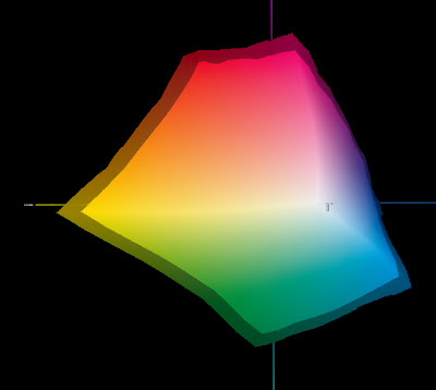
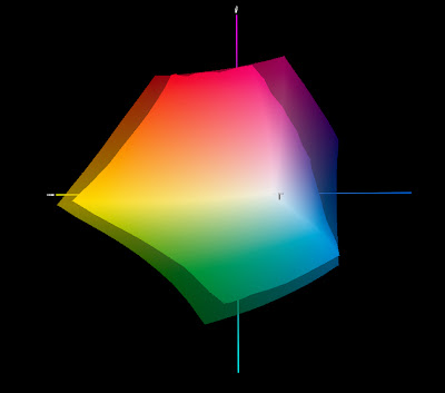
Solid graphic is 175 lpi gamut at standard SIDs. Translucent graphic is 175 lpi gamut at higher SIDs.

Solid ink densities can often be increased by about 20-30 points from industry standards on presses which have aqueous coaters. Curves are applied to plate to normalize dot gain (restore tone reproduction). Extra saturation affects all color areas on the page. Testing determines the max density that can be achieved before presswork color becomes unstable, or ink slinging or tailing occurs. Uses existing CMYK images. This is the simplest approach to add punch since the only thing in production that needs to happen, once testing is complete, is to have a curve applied to the plates and new SID targets communicated to the pressroom for jobs targeted for the extra vibrancy. A popular strategy because it does not require anything to change other than a curve applied to the plates. It will increase overall color saturation but may not increase the gamut in areas where CMYK is weak (oranges and purples). A more complete explanation of the process begins HERE. A variation on this method would be to run CMYK at normal SIDs and then do a second hit of CMY also at normal SIDs.

2) Use FM screening.
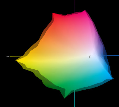
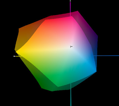
Solid graphic is 175 lpi gamut using standard inks. Translucent graphic is 20 micron FM screening gamut.

Going to a finer screen, either 20 micron FM or greater than 385 lpi AM/XM screening will provide about 10-15% greater gamut volume compared with 175 lpi AM/XM screening. The extra gamut will be available in one and two color screen tint builds only.


3) Big Gamut CMYK
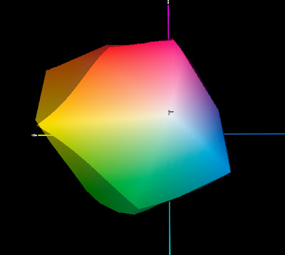
Solid graphic is 175 lpi gamut using standard inks. Translucent graphic is 175 lpi gamut using wider gamut CMYK inks - Toyo Kaleido inks in this example.

This method uses higher pigment load inks, or spectrally purer colorants (and therefore more expensive inks). Examples are Toyo Kaleido inks and (BASF) Flint Novaspace f 2010 inks. Extra saturation affects all color areas on the page. This method uses existing CMYK images, however existing separations may produce unexpected results. From a production point of view, washups and ink change overs will happen when switching from regular CMYK to Big Gamut CMYK jobs.

4) CMYK plus "bump" (touch plate) color.
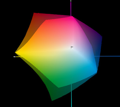
Solid graphic is 175 lpi gamut at standard SIDs. Translucent graphic is extra gamut resulting from the addition of a special Orange and special Blue.

Adds gamut only where needed (e.g. oranges, blues, etc.). Manual process in Photoshop to create 5th plate. Requires testing and experimenting to establish workflow. Uses existing CMYK images with added spot color channel to add extra vibrancy within specific images only. Note that the extra ink(s) will need to be formulated to wet trap, be screened, and have a dot gain similar to its closest process color. E.g. Red ink would mimic Magenta in lithographic performance. This method is usually used in fine art reproduction, catalogue, and automotive work to bring specific colors into gamut.

5) Swing process colors.
Solid graphic is 175 lpi gamut at standard SIDs. Translucent graphic is extra gamut in the blue range resulting from the substitution of a violet for the standard process Cyan.

This uses a standard CMYK ink set where one of the process colors, usually magenta but sometimes the cyan, is swapped out for an alternate. For example, the standard process magenta might be swapped out for a PMS Red 032, Warm Red, Rhodamine Red, or even PMS 2395. This distorts the entire gamut but can be very effective depending on image content. For example, a photo of an orange against green leaves would really pop if a warm red is used instead of a conventional magenta. This method is best used where there are no skin tones present since skin tones would look quite odd. Note that all image content is affected, including text. Requires a lot of experimentation and documented samples.

6) Big "H" Pantone Hexachrome.
Solid graphic is 175 lpi gamut at standard SIDs. Translucent graphic is extra gamut resulting from the use of proprietary Pantone Cyan, Magenta, Yellow, Orange and Green.

Uses a proprietary 6 color inkset with fluorescing agents in their pigments. Extra vibrancy affects all color areas on the page (images and text). Inks tend to have poor printability. Expensive. Manual process to do separations in Photoshop. It often delivers images that have an "artificial" look. Colors can appear garish rather than natural. Requires testing and experimenting to establish workflow. Complex separated workflow (DCS 2 files).

7) Small "H" Hexachrome.
Solid graphic is 175 lpi gamut at standard SIDs. Translucent graphic is extra gamut resulting from the use of Orange and Green.

Uses standard CMYK inks plus Orange and Green inks to expand Gamut. Uses Pantone Heximage software from Pantone to do manual separations to 6 color process in Photoshop. Extra vibrancy applies to images only. This method is popular in the label and packaging markets. It can be a good compromise compared to process 5. Complex separated workflow (DCS 2 files).

8) CMYK plus "extended" process colors.
Solid graphic is 175 lpi gamut at standard SIDs. Translucent graphic is extra gamut resulting from the use of Red, Violet, and Green "extended" process colors.

ICC profile based workflow. RGB in and separated to CMYKRG or CMYKRV, or CMYKRGB out. Fully automated process. Requires profiling the press using the appropriate inkset. Creating an RGB to CMYKXX separation profile. The profile is used by the workflow to separate the images as part of the process plan, as delivered to the workflow as a preseparated file. Extra vibrancy applies to images only.

Friday, June 19, 2009

Printing in the movies

Whenever I watch a movie or TV show that includes scenes of a topic, like printing, that I think I know something about, I'm often amazed at how it's portrayed and somewhat distorted through the director's vision. It's likely that people who aren't familiar with the profession accept what is presented in film as reality - while all I can see are the mistakes. Nonetheless it is illuminating to see how printing has been portrayed by Hollywood in film.

Please press the play arrow to view theses videos. Note that they may stop for a moment while the video buffers in the background or you may need to "wiggle" the play head to get them going.

In the 1939 movie "Mr. Smith Goes to Washington" Jimmy Stewart's character, a Boy Scout leader, prints a newspaper in his house. When party bosses try to railroad him, the boy scouts go into action and print a paper in his defense. It's terrific how realistic scenes of them at work are intercut with scenes of a big city newspaper publisher doing the same tasks.

The 1941 movie "Penny Serenade" has Cary Grant buying a country paper in California and summoning an old pal from New York to help him. The Linotype is stuck, however, the old hand thumps the middle of the magazine, getting the Linotype to work again - just the thing many folks think is the only thing press operators are capable of.

My favorite though is this scene from 1985's "To Live and Die in L.A." Willem Dafoe is a bad-boy money counterfeiter and does everything from initial image capture to final cut and trimming of his presswork. This is the type of work that I did (apart from the counterfeiting) at a small printer in Montréal during my summer jobs in the 1960s. When he huffs his breath across the plate to reveal the image...well I can't help imagining that this was the inspiration for processless CtP imaging. :-)


I'm sure there are many more examples from film and TV...however, just to get you started at your local video shop:

The Adventures of Jim Bowie (April 5, 1957)
Well "dog my cat" one of my favorite historical characters, Jim Bowie, is accused of murdering the editor of the local New Orleans Newspaper (circa 1830). Note the pressman's newspaper hat. More info on that HERE.

The Day the Earth Caught Fire (1961) The lead actor works at the Daily Express in London England. Great scenes of the "HOE" newspaper press, the workings of newspaper journalists, as well as the end of the world. "If it's a Hoe, it's the best." - the proud motto of R. Hoe & Co., Inc., maker of presses since 1803.

Newsies (1992) Newsboys in 1890s New York print a broadsheet. Typesetting and printing appear very credible except that they manage to print 100,000 by hand overnight.

Snow Falling on Cedars (1999) A scene shows a working Linotype and what may be a Wharfdale or similar hand fed press printing a newspaper in the Northwest during WWII.

Quills (2000) About the Marquis de Sade's life in the Charenton insane asylum. After his death the director puts the lunatics to work printing his works. Wonderfully detailed printshop with sewing frames, typesetting, and printing with a Stanhope press. "The compulsives set type and the manic depressives ink," the director explains.

Catch Me If You Can (2002) Tom Hanks plays an FBI agent pursuing a forger. He takes a forged check to a printshop where the wise printer tells him it was printed on a Heidelberg and such work is only done in Germany, England and France. Hanks then goes to France and finds the forger. Hmmmm.

Miss Potter (2006) Romanticised story of children's author Beatrix Potter & her romance with her publisher. As is well-known she was quite persnickety about the appearance of the color in her books. A pressroom is shown in action (perhaps the printing museum at Innerleithen in Scotland).

The Counterfeiters (Die Falscher) 2007 It fictionalizes "Operation Bernhard," a secret plan by the Nazis during the Second World War to destabilize Great Britain by flooding its economy with forged Bank of England bank notes. The film centres on a Jewish counterfeiter, Salomon 'Sally' Sorowitsch, who is coerced into assisting the Nazi operation at the Sachsenhausen concentration camp.

Seven Pounds (2008) Rosario Dawson plays a woman who prints stationery on a Heidelberg windmill in her garage.

The Book of Eli (2009)

The Green Hornet (2011)

Which has great shots of what appears to be the Los Angeles Times press facilities.
The Greatest Movie Ever Sold - 2011

Monday, June 15, 2009

All about Dot Gain/TVI (Tone Value Increase)

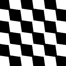
When a tone value is requested, for example, in a page layout application:it becomes represented by a halftone dot pattern generated in prepress by the workflow RIP (Raster Image Processor)
which is then imaged onto a printing plate
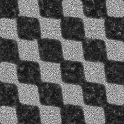
which is then inked
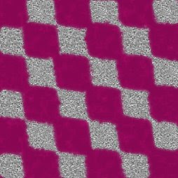
and, in the case of offset printing, transferred under pressure to the blanket
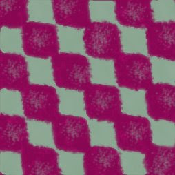
from which, again under pressure, the inked dots are transferred to the substrate – paper in this example:
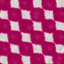
As the halftone dots move through each stage of the process they are altered slightly. "Dot gain" is the term that is used to describe the difference between the requested tone value in the original application file and the resulting apparent final tone value on the substrate as measured with a densitometer. In a film-to-plate workflow, the requested tone value is usually considered to be the tone measured on the film, rather than the tone requested in the application.
Dot gain is inherently neither good nor bad, it is simply a characteristic of a process that uses pressure to transfer an ink to a substrate.
By convention, total apparent dot gain is an incremental, or add-on, increase in apparent dot area – not a multiplier. For example, 18% dot gain means that the tone value, e.g. 50% on the plate has resulted in a 68% tone value in the final presswork (50% + 18%) rather than 59% (50% x 1.18).
Traditionally, dot gain is used as a process control metric, i.e. for a given tone request there is an expected, target, apparent dot gain value – e.g. for a requested 50% tone the expectation is the presswork will gain 18% resulting in the 50% request measuring 68% on the press sheet. If the target dot gain is not achieved then the print process is examined to determine the cause for failure.
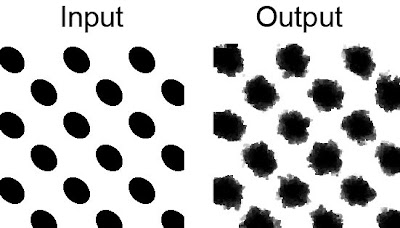
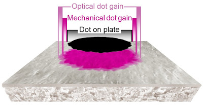
There are two primary components of dot gain; mechanical (the physical spreading of the ink under pressure), and optical (the effect of light scatter within the substrate around the perimeter of the dot) - effectively the shadow of the dot within the substrate.The physical and optical dot gain combined are loosely referred to as "dot gain" and, although a reasonably appropriate term, it can be misunderstood and misinterpreted. "Tone value increase," or simply TVI, is a more appropriate term that better describes the over-all effect and is a term gaining in popularity. From a measurement point of view dot gain and TVI are identical.
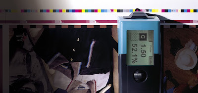
Because of the optical gain component, it is not possible to directly measure dot gain/TVI. The method most commonly used involves using a densitometer to measure and compare a patch of solid ink (100%) to a specified tone patch (e.g. 50%) with the application of a formula to calculate the total apparent dot gain/TVI.Because of the complexity of dealing with the non-linear mechanical and optical components of dot gain, many formulas have been proposed to calculate total dot gain/TVI, including; the Demichel/Neugebauer equations, the Murray-Davies equation, the Yule-Nielsen equation, the Clapper-Yule equation, the Huntsman model, etc. Currently, the most popular equation, although faulty, none the less is the one that is built into most densitometers - the Murray-Davies equation. Since different formulas give different results, the important thing is to make sure that when discussing dot gain/TVI values, the formula that was used is also communicated.

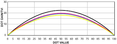
Historically dot gain/TVI target values for presswork were provided for the 50% tone only. These values, for a 175 lpi halftone screen were: C 20%, M 20%, Y 18%, K 22% at their appropriate solid ink densities. Unfortunately, defining a single tone value as the target for dot gain/TVI does not indicate the actual appearance of the actual presswork.
For example, here is the theoretical print characteristic plotted using only the published 50% dot gain/TVI target values:
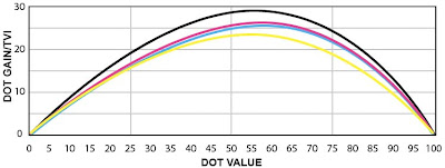
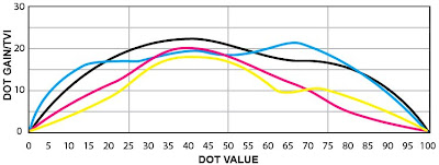
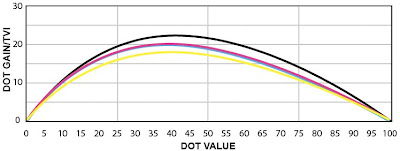
However, measuring and plotting dot gain/TVI at several points through the tone scale defines the "print characteristic" and provides a much more effective appearance-based target for the presswork. Here, based on an actual press run using a 175 lpi AM screen, is the print characteristic targeting the same published 50% dot gain/TVI target values:
In order to achieve better alignment between proofs and presswork as well as presswork from different locations, industry standards and specifications are increasingly adopting appearance-based targets (i.e. a specified print characteristic) for press work. The goal is not to achieve a specific dot gain/TVI at a single tone, but to target the tonal print characteristic irrespective of what dot gains/TVI values are needed to achieve it.

Making the print characteristic the target also enables different screening technologies, such as FM/Stochastic screens that have a different inherent print characteristic, e.g.:to make use of dot gain/TVI curves applied in plate making to align their presswork appearance to the industry target/standard/specification.

Dot gain/TVI can provide more than just the print characteristic, it can also reveal issues with ink transfer. In this example, plotting the dot gains through the tone scale:shows that although the 50% gains are within specification and produce correct grey balance, there are issues with ink transfer in other parts of the tone scale, and hence this print condition should not be characterized/profiled until the on-press issues are resolved. One of the characteristics of proper ink transfer in CMYK presswork is when all four dot gain/TVI curves have a similar contour, are clustered together, and are smooth as in this example:
Having a documented standard for dot gain/TVI also helps print production to forensically determine whether a color shift (as in the right side of this image):is caused by incorrect curves applied to plates, too high SIDs, slur, doubling, pressure/squeeze, etc.

Some of the factors that cause dot variations (dot gain/TVI):

Film: mounting, exposure time, vacuum in plate exposure, development time, development chemical condition
CtP: laser exposure integrity, development time, development chemical condition
Printing plate: material wear and tear, dampening solution quantity, pH value, water hardness, temperature, incorrect tone curves
Inking: ink film thickness, consistency, temperature
Printing plate/blanket: packing, type of blanket
Printing substrate: coated, uncoated, surface texture
Presswork: ink transfer, pressure/squeeze, slur, doubling, offsetting, over/under emulsification

Below are the historical dot gain/TVI value (and SID) targets for different classes of presswork. These values are based on densitometers set to Status "T" black backing, measured dry.

Sheetfed offset:
Grade 1 & 2 premium gloss coated @ 175 lpi:
C: 1.40/20%, M: 1.50/20, Y: 1.05/18, K: 1.70/22
Grade 1 & 2 premium matte coated @ 175 lpi:
C: 1.30/22%, M: 1.40/22, Y: 1.00/20, K: 1.60/24

Web offset (SWOP):
Grade 3 & 5 coated @ 133 lpi:
C: 1.40/20%, M: 1.50/20, Y: 1.05/18, K: 1.70/22

Newsprint (SNAP):
Coldset @ 85 lpi:
C: .90/30%, M: .90/30, Y: .85/28, K: 1.05/32
Heatset @ 100 lpi:
C: 1.08/32%, M: 1.15/32, Y: .95/30, K: 1.20/35
Wednesday, June 10, 2009

Creating Custom Halftone Dots

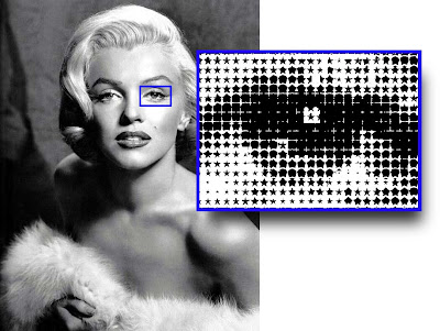
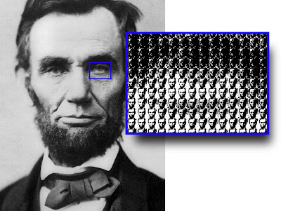
When we think about halftone dots we're usually thinking in the traditional terms of Round, Elliptical, Square, etc., however, halftone dots don't have to be restricted to such simple shapes. For specialty projects you might consider using a custom halftone dot (click on images to enlarge).

Perhaps a "Star" dot to reflect the iconic status of the subject:
Or you could even use the subject itself as the dot shape:
How to create a custom halftone dot

A halftone screen is built using several components. The two that are needed to create a custom halftone are the "spot function" which defines the shape of the dot and the "threshold array" which determines how each dot is created.
The spot function can be any graphic, including a photographic image. It should be visually simple, made up of 256 levels of grey and fit into a square shape.
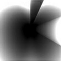
For this example we'll use the Apple logo for the spot function - making it our custom halftone dot.To convert it into a threshold array we'll use the blend tool in Adobe Illustrator:On the left is the original logo in Illustrator. Next is the logo at two sizes - the small black apple in front of the larger white logo. The third graphic is a 256 level Illustrator blend of the small black apple and large white one. The graphic is then imported into PhotoShop and cropped to minimize the amount of white in the graphic. This will become our threshold array:
The Apple logo threshold array.

To apply the custom halftone dot:

1) In Photoshop, reduce the apple image to make a "dot" the size desired for the final image. For example: an image that is 75 pixels wide would make 8 dots per inch for a 600 pixel wide image. Use "Image"--> Image Size to change the entire image as required.

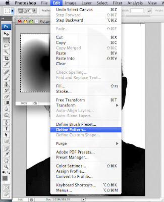
2) Select the apple image with the Rectangle Selection Tool. Then choose Edit--> Define Pattern. Give it a name (in this case "Apple logo") and press OK.
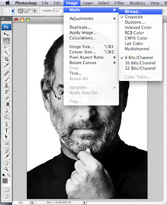
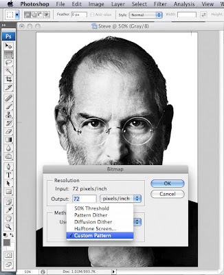
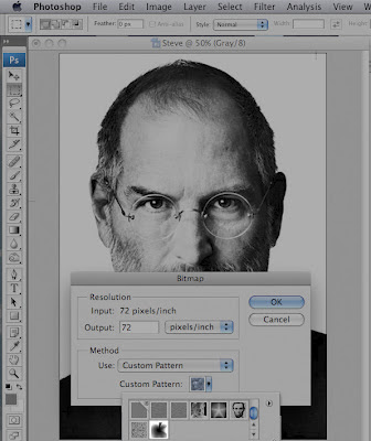
3) Halftone the original image by choosing Image--> Mode--> Bitmap. For "Method", choose "Custom Pattern" and then choose the "Apple logo" pattern. Then enter an Output Resolution. The amount entered will determine how small the halftone dot will be in the final image. The higher the number, the smaller the dots. Choose a resolution that is a multiple of your target output device's resolution. For example, if your output device has a resolution of 2,400 dpi, choose 2,400, 1200, 600, or 300 dpi for the bitmap.
Click OK.

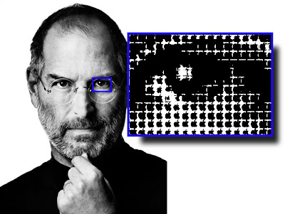
Voila! Steve Jobs is now rendered with a custom halftone using the Apple logo as the dot shape.
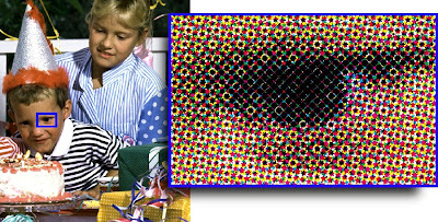
While black and white images are the easiest to do as well as the most effective, it is possible, with a bit more experimentation to do a 4/C image. This one uses the Star dot. Click on image to enlarge:

Because you can't rotate the halftone screens for each of the process colors - the trick is to take each process color channel and rotate it to the correct angle, screen it and then rotate back so that they overlay correctly and recompose the image. Here is the step by step process: Open each channel as a new document. Rotate each channel to the correct angle: C +15º, M+75º, Y 0º, K +45º.
Convert each channel to a bitmap using the pattern/threshold array. Convert each channel back to greyscale. Rotate each one back to its original 0º state, C -15º, M-75º, Y 0º, K -45º. Finally, return each bitmapped channel into a composite CMYK image and align the channels.