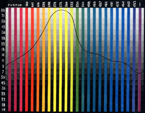
 It was published in "The Complete Amateur Photographer" by Dick Boer, 1948. The idea behind its use was to determine how well the panchromatic film that the photographer was using translated color according to how the human eye sees that relationship.
The test method was quite straight forward. The photographer would take a black and white photograph of the Lagorio Chart using panchromatic film and then make a print of that image. The photographer would then plot a curve on the photographic print where the grey patches matched the color bars (now rendered in grey) - plotted using a dotted line in the image below:
 This chart was also recommended by prepress personnel to help them translate color images into black and white halftones while maintaining the appropriate tonal relationships. Indeed this principle could still be used today to make conversions from color images to black and white in applications like PhotoShop.
So what's the mystery? Well, this is the only chart I've ever seen that plots the grey scale response of human vision. None of my other graphic arts books (and I have quite a library) contains a chart like this. Nor does there seem to be any information on the internet about Lagorio and/or this chart. Who was Lagorio and how did he/she determine the human eye's tone response? Was it just what he saw, or were committees of experts involved? The mystery remains.
If you can shed any light on the Lagorio Chart - please contact me via email (pritchard gordon @ gmail (dot) com) and I'll add an addendum to this post.
No comments:
Post a Comment