Background - pixels make the original image
A digital "raster" image acquired from a scanner, a digital camera, or created directly in a "paint" application like Adobe Photoshop is made up of a mosaic of "pixels" (picture elements)."
Here is an original image at actual size:

Here is a close up view showing the actual pixels that form the image:

The physical size of the image is described by two numbers which can be expressed two ways:
1) The number of pixels per inch/centimeter.
and
2) The number of pixels in both horizontal and vertical dimensions.
Or:
1) The number of pixels per inch/centimeter.
and
2) The horizontal and vertical dimensions expressed in inches/centimeters.
Those are just two ways of saying the same thing.
Here is the original image with a dialog box showing its dimensions:

Note that the dimensions have a "lock" icon beside them. This is because the relationship of pixels per inch (ppi) and vertical/horizontal size are "locked" together. Changing one changes the other as you can see in the below dialog boxes (click on image to enlarge):

Note that as the resolution is changed (from 600 to 300 and 300 to 150 pixels per inch) only the density of the pixels changes, not the number of total pixels in the image, in this case 1412 pixels x 2028 pixels, therefore the file size remains the same. Put another way, each time the resolution in ppi is increased, or lowered, the physical image size changes but the total number of pixels forming the image (and hence the detail) remains the same.
Note that I use the term "pixels per inch" - ppi. Very often the term that is used is "dots per inch" or dpi. Technically the terms are not interchangeable - however, in daily usage, when speaking about digital images the terms are considered as meaning the same thing. You may sometimes hear the term "spi" - samples per inch. This refers to a scanner's resolution - i.e. it ability to acquire an image at so many samples per inch (e.g. 300 spi). Again, in practical usage, when speaking about digital images - ppi, dpi, and spi can be understood as meaning the same thing.
Interestingly, digital cameras typically do not have a resolution assigned to them.

Instead a digital camera captures data based on the "megapixel" ability of its CCD sensor. For example, a 14.2 megapixel camera might capture an image that's 4592 pixels by 3056 pixels, which equals 14,033,152 total pixels. When you open the file into an image-editing program a resolution must be assigned to the file. Most programs, including Photoshop, use 72 ppi as the default resolution.
Background - halftone dots make the image reproduction
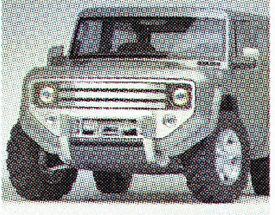
Because printing presses can only lay down 100% ink or 0% ink, digital images acquired from scanners, digital cameras, or created directly in "paint" applications need to be converted into a binary (on/off) format. This is done through a process called halftone screening. The result is that the image will be converted to dots of either 100% or 0% ink with the original tones being simulated, in this case, by the size of the dots. Bigger dots represent darker tones - smaller dots represent lighter tones:

The fineness of the screen, and hence the level of detail in the original that can be preserved, is determined by how densely packed the dots are and is indirectly described by how many rows - or
lines of dots are used per inch (or centimeter) to create the image. These virtual lines are highlighted in red below:

In this example the image is made up of 85 lines of dots per inch – expressed more commonly as an 85 lines per inch halftone - or more simply stated: an 85 lpi halftone image.
The key thing to remember is that although the halftone image is made up of dots - the level of detail that it can reproduce is described in terms of lpi NOT dpi.
So, original image pixel density/detail = ppi, spi, or dpi. Halftone reproduction dot density/detail = lpi.
Of course, in order to pack more lines of dots into an inch - the smaller the dots become and hence the greater amount of image detail that is preserved.
40 lpi halftone:

100 lpi halftone:

200 lpi halftone:

It is the relationship of how densely packed the original pixels are (
see part 1) compared to the frequency of lines per inch of the halftone screen dots that determines what image resolution is appropriate for its reproduction in print.
The relationship between dpi/ppi and lpi for
grayscale images
The guiding principle for understanding what original image resolution (ppi/dpi) is needed compared to the halftone screen (lpi) that will be used is that the image pixels should always be more densely packed (ppi/dpi) than the detail resolving ability (lpi) of the halftone screen that is used.
To illustrate this principle I'll take a section of the same image at different resolutions (ppi/dpi) and reproduce it using the same 150 lpi halftone screen:
 Original 75 ppi/dpi - halftone screen 150 lpi:

Here the image ppi/dpi is one half of the halftone screen resolution (lpi). As a result the halftone reproduces the individual pixels of the original. This visible artifact is termed "staircasing," the "jaggies," or "pixelation."
Original 100 ppi/dpi - halftone screen 150 lpi:

Here the image ppi/dpi is two thirds of the halftone screen resolution (lpi). As a result the halftone still reproduces the individual pixels of the original - but they are less visible.
Original 150 ppi/dpi - halftone screen 150 lpi:

Here the image ppi/dpi is equal to the halftone screen resolution (lpi). As a result the halftone still reproduces the individual pixels of the original - but they are much less visible.
Original 225 ppi/dpi - halftone screen 150 lpi:

Here the image ppi/dpi is 1.5 times greater than the halftone screen resolution (lpi). Although some original image pixels may still be visible, in general, the halftone no longer resolves the individual pixels of the original - just the tones they represent.
This
minimum required original resolution can be represented by the formula:
1.5 X lpi = ppi @ 100% reproduction.
Original 300 ppi/dpi - halftone screen 150 lpi:

Here the image ppi/dpi is twice the halftone screen resolution (lpi). As a result the halftone no longer resolves the individual pixels of the original - just the tones they represent.
This
ideal required original resolution can be represented by the formula:
2 X lpi = ppi @ 100% reproduction.
Original 600 ppi/dpi - halftone screen 150 lpi:

Here the image ppi/dpi is four times the halftone screen resolution (lpi). The image file size is about 7 times larger than the 225 ppi/dpi image but provides effectively no difference in the final reproduction.
The relationship between dpi/ppi and lpi for CMYK
images
As with grayscale images, the guiding principle for understanding what original image resolution (ppi/dpi) is needed compared to the halftone screen (lpi) that will be used is that the halftone screen should not reproduce the image pixels themselves but instead the tones the pixels represent. It is worth comparing these images to their grayscale equivalents in part 3.
To illustrate this principle, I'll take a section of an image rendered at different resolutions (ppi/dpi) that has been converted from grayscale to CMYK and reproduce it using the same 150 lpi halftone screen:
 Original 75 ppi/dpi - halftone screen 150 lpi:
Here the image ppi/dpi is one half of the halftone screen resolution (lpi). As a result the halftone reproduces the individual pixels of the original. This visible artifact is termed "staircasing," the "jaggies," or "pixelation." That being said, the jaggies are less severe than we saw in the grayscale image at the same ppi/dpi. Also the numbers on the sail appear clearer. This suggests that it might be possible to use a lower image resolution for reproducing a CMYK image than can be used for a grayscale image.
Original 100 ppi/dpi - halftone screen 150 lpi:

Here the image ppi/dpi is two thirds of the halftone screen resolution (lpi). As a result the halftone still reproduces the individual pixels of the original - but they are less visible.
Original 150 ppi/dpi - halftone screen 150 lpi:

Here the image ppi/dpi is equal to the halftone screen resolution (lpi). Because the CMYK image is a composite of four individual halftone images it tends to lessen the visibility of the individual pixels of the original.
This
minimum required original resolution for a CMYK image can be represented by the formula:
lpi = ppi @ 100% reproduction.
Original 225 ppi/dpi - halftone screen 150 lpi:

Here the image ppi/dpi is 1.5 times greater than the halftone screen resolution (lpi). The halftone no longer resolves the individual pixels of the original - just the tones they represent.
This
ideal original resolution can be represented by the formula:
1.5 X lpi = ppi @ 100% reproduction.
Original 300 ppi/dpi - halftone screen 150 lpi:

Here the image ppi/dpi is twice the halftone screen resolution (lpi). As a result the halftone no longer resolves the individual pixels of the original - just the tones they represent.
This
maximum required original resolution can be represented by the formula:
2 X lpi = ppi @ 100% reproduction.
Original 600 ppi/dpi - halftone screen 150 lpi:

Here the image ppi/dpi is four times the halftone screen resolution (lpi). The image file size is about 7 times larger than the 225 ppi/dpi image but provides effectively no difference in the final reproduction.
The below table provides image resolution requirements for a variety of typical print applications:

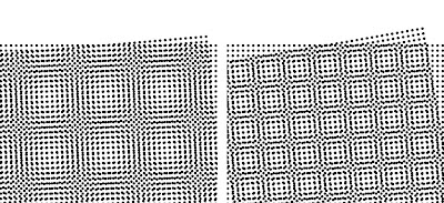
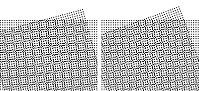
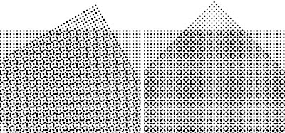
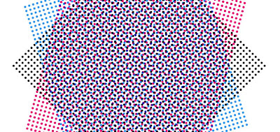
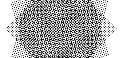
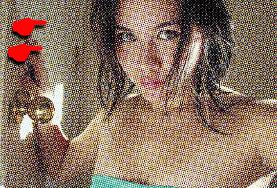
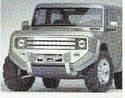
Note that this table refers to conventional "AM" halftone screening where the lpi signifies the dot density and hence the resolution of the halftone screen. However, there is another type of halftone screen in use which does not have a traditional lpi. Instead, this type of screening organizes the halftone dots in random appearing patterns. Below are three different vendor's offerings
(click on images to enlarge):


This type of halftone is called "FM" or "Stochastic" screening (covered in other posts in this blog). Rather than indicating resolution according to "lpi" - the average actual dot size, specified in microns, of the screen pattern is used instead. Typical dot sizes are: 10 - 20 micron for commercial work, 20 - 25 micron for magazine work, and 35 micron for newspaper work. Because this type of screening has a higher average resolution than conventional AM screening - it's a good idea to use images at a higher resolution to take advantage of this screening's detail rendering capability. Typically 400 ppi/dpi for 10-20 micron FM, 300 ppi for 25 micron, and 200 ppi/dpi for 35 micron.
Image resolution "gotchas" – where things can go wrong
Whether you are targeting your images for AM or FM screening, there are at least three places where the resolution of the images may be accidently altered:
1) If the image is resized/scaled in the page layout application – it may no longer have an appropriate resolution:

2) If the image is resized/scaled when the file is converted to the PDF format – it may no longer have an appropriate resolution:

3) If the printshop's workflow is setup to resample incoming documents – they may no longer have an appropriate resolution. Most prepress RIPs are set, by default, to downsample incoming files to 300 ppi/dpi.


